And, then, of course, there was chromolithography. Developed as a way to reproduce paintings cheaply, this technology is distinguished from the other forms of color lithographic printing by two important features: first, the lack of a prominent black foundation to the image and, second, the overprinting of many different colors on top of each other with none necessarily dominating.
The chromolithograph thus appears not as a colored line drawing but as an integrated picture (fig. 32). Widely used to bring art to the masses, chromolithography has been called the “Democratic Art.”1 Developed in the 1830s, it remained a craft and artistic practice through the 1840s and 1850s. In the USA, the technology began to take off only after 1860, its use picking up considerably after the Civil War to meet the burgeoning public demand for printed color images.2
The process is plainly explained by “progressive” proofs.3 Cat. 27, from an 1894 German encyclopedia, lays out a simple progressive, illustrating how nine colors are progressively overprinted to make a final image. First an orangey-red flesh tone is printed as a base, then a yellow is printed followed by a brown for hair, grass, and shadows. The fourth color, light blue, combines with much of the yellow layer to make green vegetation, but holes in the blue allow the chicks to suddenly stand out. Greater detail is added with a pink/red for the girl’s dress, a dark blue to darken elements of the vegetation, grey to fill out shadows and creases, red to finish of the chicken’s comb and the dress, and then a final dark grey to give final depth. The result is very much in the cloying style of decorative chromolithographs printed for the popular market, driven by Victorian nostalgia and sentimental notions of childhood. This mawkish aesthetic has led art historians to tend to overlook and deride chromolithographs.4
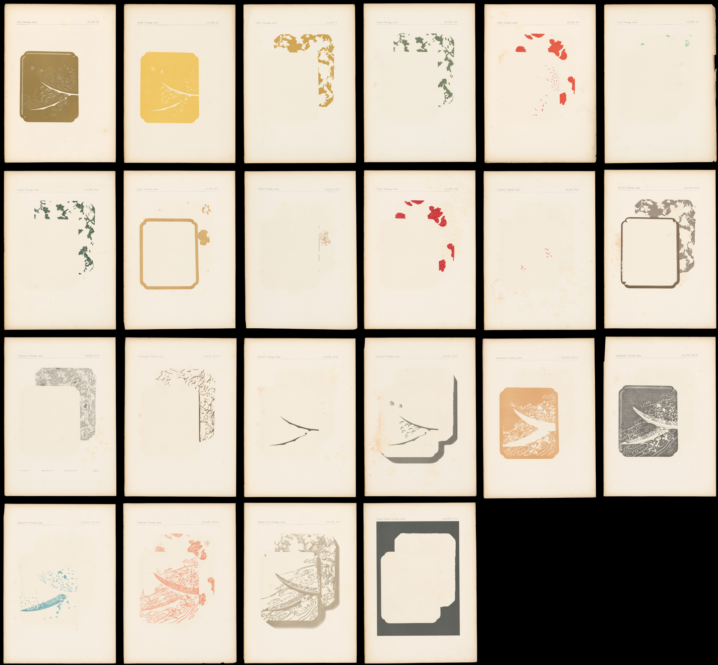
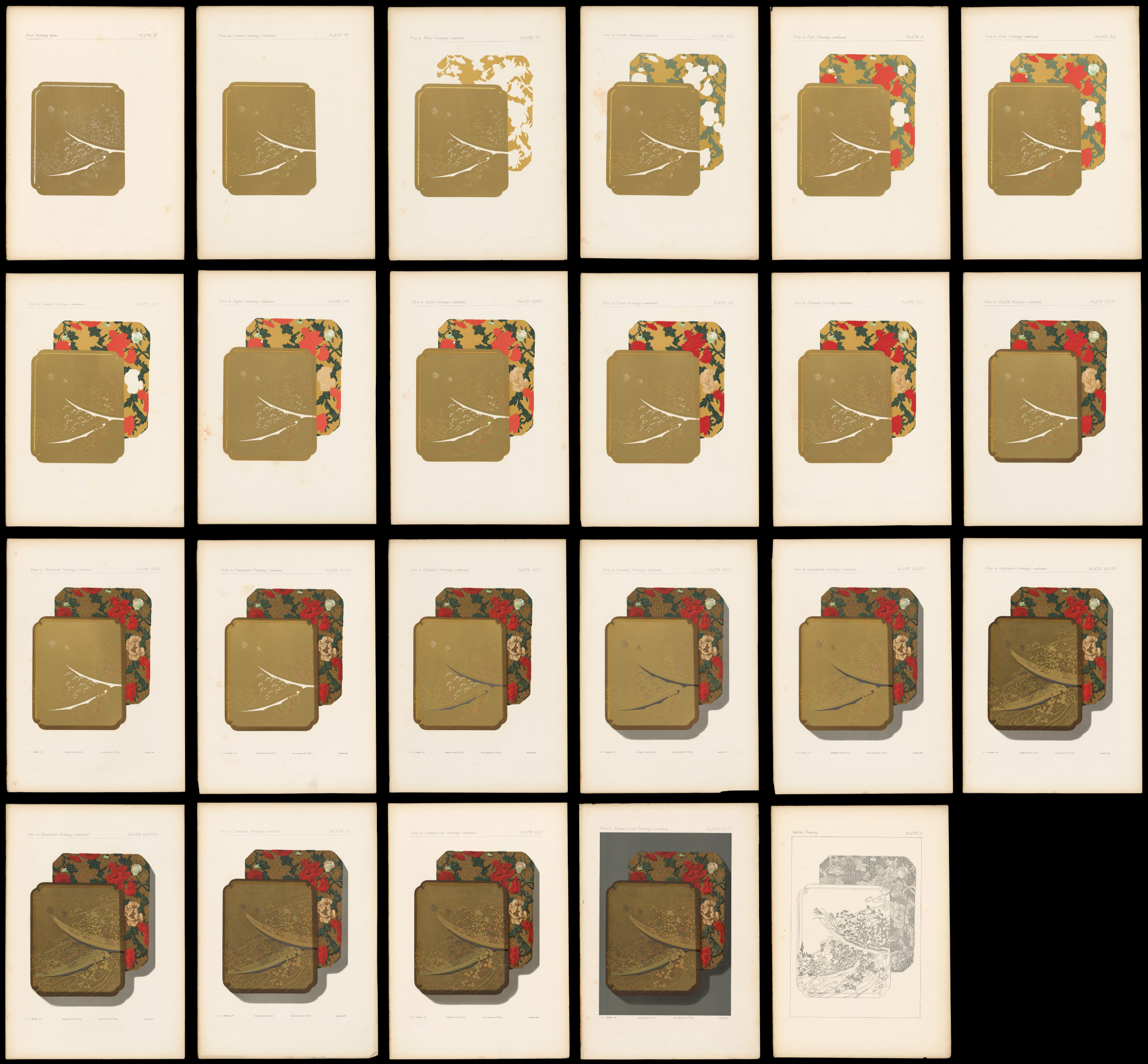
Cat. 28 offered a more complex progressive for wealthier connoisseurs. The British architect and artist George Ashdown Audsley issued this set of forty-four proofs in 1883, showing how a reproduction of the cover of a particularly ornate Japanese lacquered box was built up from twenty-two different colors. The accompanying detailed explanation of the chromolithographic process was the work of the French art printer Alfred Lemercier. The sequence began with the key image (pl. 1), which was transferred to all twenty-two stones. The first two colors are then reproduced, followed by their combination when printed on the same page (pls. 2–4). The proofs continue, each color followed by the cumulative combination, until the final image is achieved (pl. 44).5
When Godefroy Engelmann had pioneered the technique of chromolithography, he used a waxy crayon to “fill in” the portions of each stone that were to be printed. As with a child’s crayon drawing, the result was not a smooth and even finish to each printing surface, but rather a slightly textured one. The texture of course carried over to the impression. (Indeed, such texturing is evident in other lithographic color printing.) In chromolithography, the texturing significantly helped the superimposition of the colors, as in the creation of realistic human skin tones (fig. 34). There was some variation in the quality of the textures, depending on the precise methods used to prepare the printing surfaces. Also, the printing surface did not have to feature only washes; the printing surface might also be prepared in a crudely pointillist manner to give a coarse pattern to parts of the impression (fig. 35).
Chromolithography was not used for maps and images with pronounced linework, as in common regional maps or territorial maps. Rather, it was used for the construction of perspective views, such as bird’s-eye views of landscapes or visualizations of natural and social phenomena, and for dramatic and colorful images to appeal to the consumer. Chromolithography was used to visualize the world and to show the spectacular. Color printing in general, and chromolithography in particular, “began to change perceptions of the world.”6
Levi Yaggy’s Spectacular Visualizations of Nature
A sustained use of chromolithography was made by the Chicago publisher, Levi Yaggy, who published a number of works for teaching geography, history, and anatomy. Each work comprised an unbound portfolio of large images that teachers could display individually on classroom walls. Surviving copies of these portfolios accordingly tend to be incomplete. Yaggy issued two portfolios for teaching geography, in 1887 [Cat. 15, Cat. 16, Cat. 17] and 1893 [Cat. 18, Cat. 19, Cat. 20, Cat. 21, Cat. 22, Cat. 23, Cat. 24, Cat. 25, Cat. 26]. In both, he used chromolithography to bring the world to life through complex visualizations of humans and environments. None of the scenes were actually drawn from life, and many were plainly composites assembled in a studio, but chromolithography gave them all verisimilitude—the image of truthfulness.
Yaggy’s 1887 Geographical Study was a sturdy wooden box full of loose contents: astronomical displays; a papier-mâché relief map of the USA in the base of the box; seven general maps of the world in two hemispheres and five continents; and a schematic explanation of the world. The regional maps, such as that of North America [Cat. 15], are all color lithographs, each color neatly contained within boundary lines, with only slight registration errors. The Geographical Study was accompanied by an instruction manual that laid out lesson plans with which teachers might draw out students as they looked at the portfolio’s several parts.7
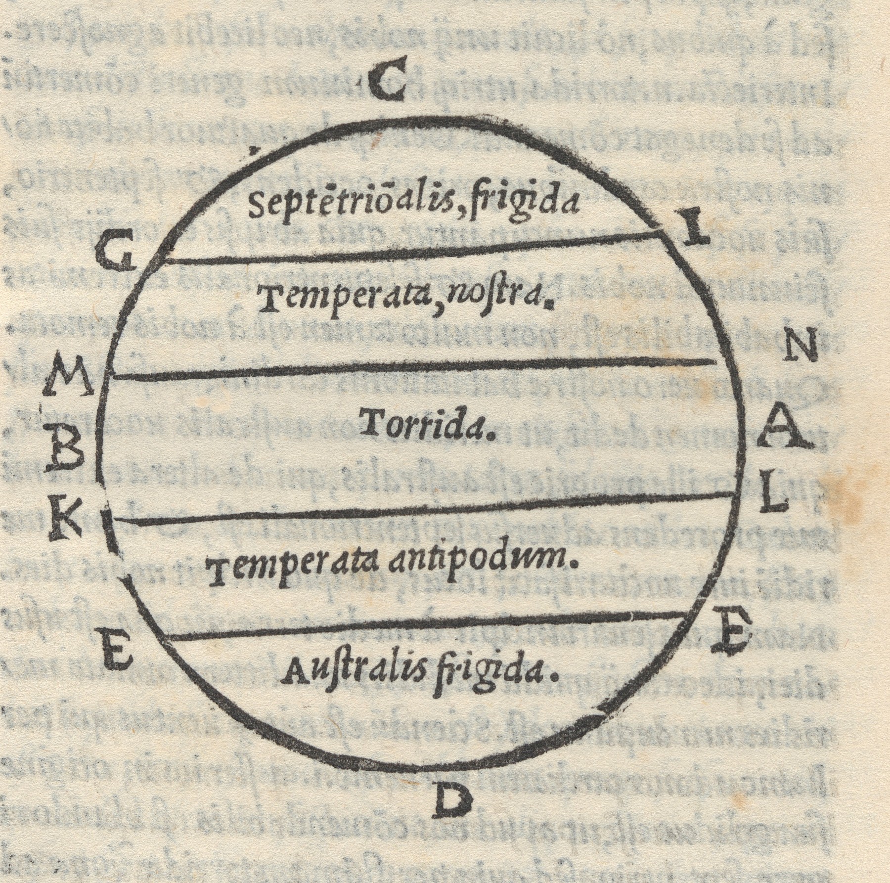
In this first geographical work, Yaggy crammed the terrestrial spectacular into a schematic map of the world [Cat. 16]. At first sight, this image resembles the “zonal maps” included in medieval and early modern editions of Macrobius’s early fifth-century commentary on Cicero’s poem, The Dream of Scipio (51 BCE) (fig. 36). Zonal maps depict just one hemisphere, dividing it into the five Aristotelian zones defined by earth-sun geometry. At the poles, bounded by the Arctic and Antarctic circles were the two “frigid zones,” which the Greek philosophers deemed too cold for most life. Around the equator, bounded by the tropics of Cancer and Capricorn was the equatorial “torrid zone” that many ancient geographers held to be too hot for life. In between lay the two “temperate zones” which were the home of life and civilization.8 In Yaggy’s schematic map, however, each zone extends around the entire world, not just across one hemisphere. The northern temperate zone runs, for example, from Japan at the far right to the North American plains at the far left, with the Mall in Washington, DC, in the middle (fig. 37).
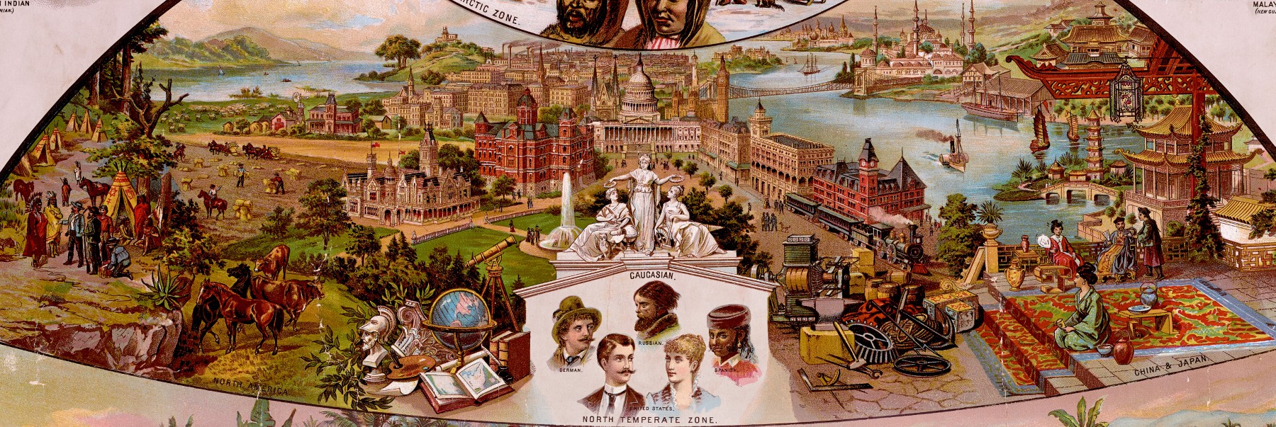
The full schematic map comprises a thematically layered image that neatly captures the environmental foundations of racism and imperialism of the late-nineteenth century. Geographers at the time commonly organized the earth’s flora and fauna, which included the supposed human “races,” to which they gave further ideological significance. The northern temperate zone was the home of so-called “civilization,” of learning and industry, and of the “White race,” symbolized by the collection of representative images of “Caucasian” people and the products of learning and of industry at almost the graphic center of the overall image. The heat and ease-of-living of the torrid zone, from New Guinea to the Amazon basin, was thought to be too debilitating for White settler colonists to stay for long without “going native.” The torrid zone was the home of less-civilized peoples, indicated by the representative figures clustered around the map; imperialists argued that such regions were best subjected to White control via local rulers. By contrast, the southern temperate zone, from New Zealand, through South Africa, to Argentina, was considered by imperialists to be a “proper” site for colonies of White settlement because the climate was just right.

The title pages to Yaggy’s two geographical portfolios both imaged the earth as if seen from a distant orbit [Cat. 16, Cat. 17]. They did not depict political boundaries or the names of states and cities, but instead showed mountains and deserts, grasslands and forests, and oceans and the atmosphere. These impossible views were a particular conceit of the late-nineteenth century. Derived from the physical globes designed to teach the blind, these images promoted the idea of humanity as living within, and as being a part of, the global environment. For radical and anti-imperial geographers, these globes pointed to the artificiality of political boundaries and to the proper unity of humanity.9
In his 1893 Geographical Portfolio, Yaggy distributed the themes of the schematic 1887 world map across several, smaller folios. Each folio presented a visualization dedicated to one spectacular topic.10 He depicted the spectacle of the world’s flora and fauna in part by designing imaginative cross-sections of the atmosphere [Cat. 18] and of the oceans [Cat. 20]. He also remapped the distribution of humanity across the Aristotelian zones now mapped by climate (red torrid zone, yellow temperate zone, and blue polar zone) and vegetation [Cat. 19]. As with his earlier schematic visualization of the earth, the division of humanity into “races” was still tied to climactic conditions, reinforcing false hierarchies perpetuated by Scientific Racism during the Age of Imperialism.
Further visualizations in the Geographical Portfolio focused on depicting the nature and structure of the earth in lush detail: an idealized geological cross-section [Cat. 21]; several idealized landscapes clustered in one view, with kinds of natural and human features labeled for ease of memorization by students viewing these items in their classrooms [Cat. 22]; and a dramatically detailed image of the topography of the United States, again constructed as if seen from above [Cat. 23]. And Yaggy further reconfigured the images of the Aristotelian zones in his 1887 world map to make three separate images of the northern frigid zone [Cat. 24], the northern temperate zone [Cat. 25], and the equatorial torrid zone [Cat. 26]. In doing so, Yaggy again rehearsed the climatic determinism and racist differentiation of the human races. These concepts underpinned the US turn to empire after the Spanish American War of 1898 and the subsequent annexation by the USA of the Philippines and Puerto Rico. Meant as classroom aids, Yaggy’s geographic visualizations also reinforced racist tropes commonly found in the “Races of Men” chapters of the era’s primary and secondary geography textbooks.
Bird’s-Eye Views of Places of Note
The principal map-related use of chromolithography was for realistic pictures of important landscapes as if seen by a bird in flight. While ballooning might have still been a rarity in the mid-19th century, it had nonetheless captured the popular imagination. Beginning in the 1850s, intrepid photographers began to utilize balloons to take pictures of small portions of the earth’s surface from the air. The rise of the “bird’s-eye view” manifested the contemporary fascination with such views from above; they could depict areas much greater than early aerial photographers could achieve, and they did so in a more apparently naturalistic manner. The chromolithographic layering of color was specifically used to profound effect in two different periods to visualize landscapes of war and landscapes of leisure.
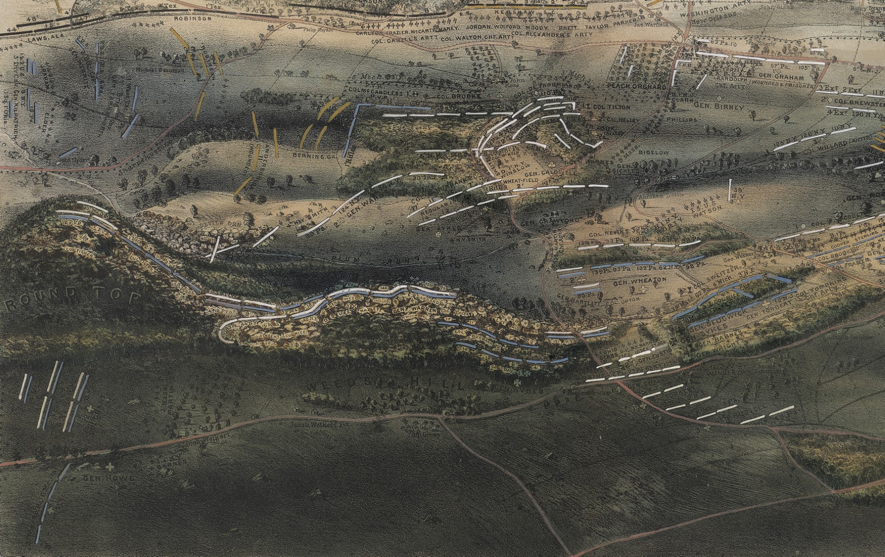
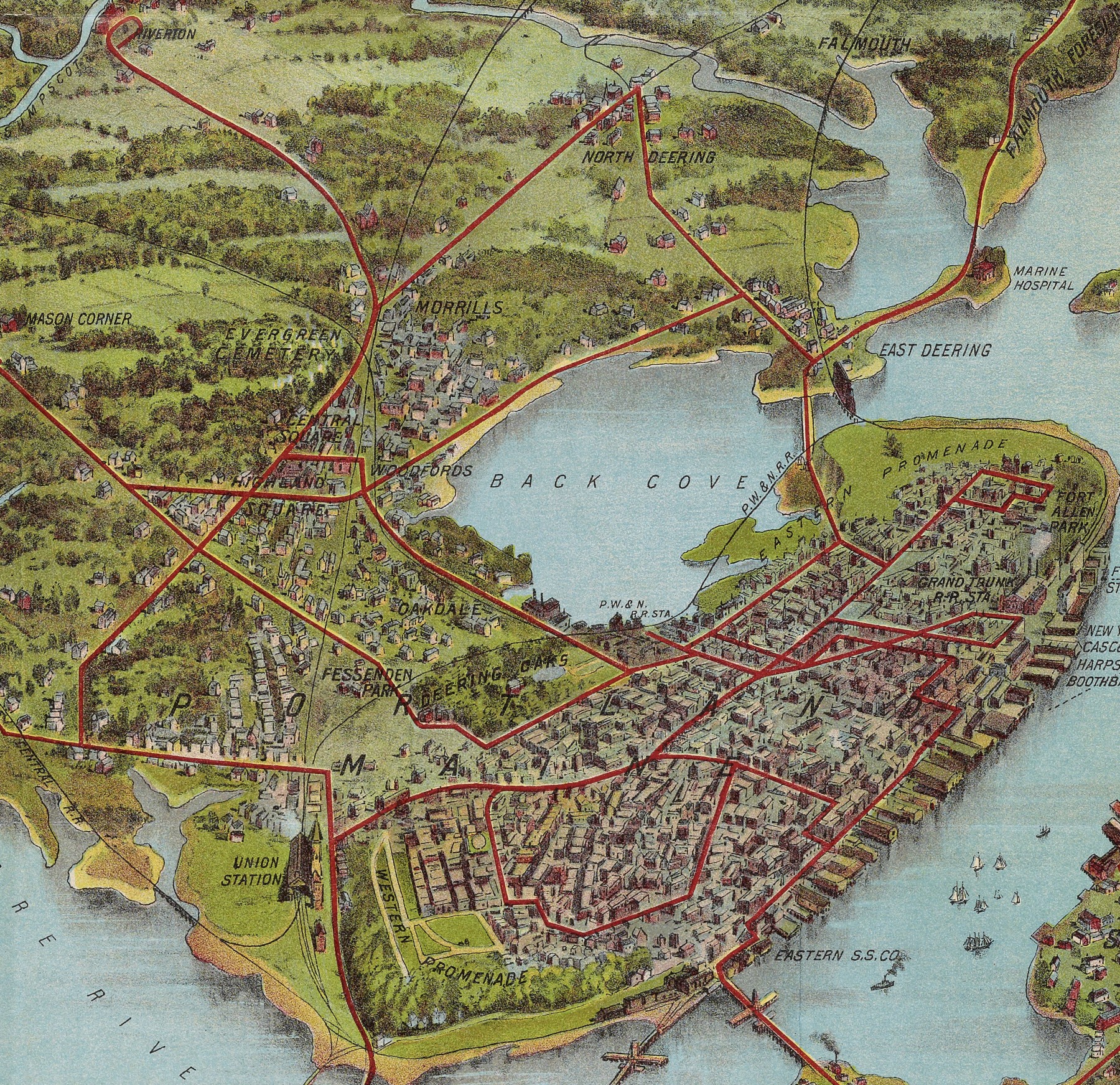
While northern publishers issued many images of military landscapes during the Civil War (1861–65), only a few remarkable sites were produced as chromolithographic views: the entire seat of war in John Bachmann’s impossibly high-altitude panoramas, which he nonetheless claimed to have “drawn from nature” [Cat. 29, Cat. 33]; major battlefields [Cat. 30]; and Union hospitals and prisons [Cat. 31, Cat. 32]. Much later, between 1890 and 1914, a new wave of middle-class tourism generated great interest in landscapes of pleasure that were readily accessed by trains, trolleys, and ferries. The exhibition offers just a small selection of the many chromolithographic views of popular tourist sites produced during this period [Cat. 34, Cat. 35, Cat. 36, Cat. 37, Cat. 38, Cat. 39, Cat. 40, Cat. 41, Cat. 42].
Chromolithographic bird’s-eye landscapes seem not to have been widely produced between 1865 and about 1890. The distinction is evident in the work of the artist and photographer John Badger Bachelder: the thirty-five known bird’s-eye views of US towns and cities that he produced between 1854 and the end of the Civil War were all “straight” lithographs, but he used chromolithography for his stunning 1863 view of Gettysburg [Cat. 30].11 The bird’s-eye views of key Civil War landscapes were special and warranted the extra verisimilitude offered by the still relatively new technique of chromolithography. The quotidian views of towns and cities, however, continued to be produced as monochrome or tinted lithographs.12 By contrast, the later, touristic views were the product of the integration of chromolithography into popular culture in the USA.
It is apparent that chromolithography was used to create not only geographical images with verisimilitude, but also stand-alone images. Yaggy’s pedagogic spectacles and the bird’s-eye views of Civil War landscapes were all intended for display, like the painted works of art that chromolithography was intended to reproduce and mimic. The same principle applied to some of the touristic views, such as those of the World’s Columbian Exposition, in Chicago in 1893 [Cat. 37], and of the summit of Mt. Washington [Cat. 38], but the majority of the later phase of chromolithographic views were adapted to stand-alone pocket guides.
The guides were a function of fundamental changes after the Civil War in the character of tourism within the USA. The old grand, spa-like, destination hotels in picturesque areas like the Adirondacks and the White Mountains were rapidly supplemented by less communal tourism and vacationing. In large part driven by railroads, trolley car systems, and ferry companies seeking newly affluent, middle-class customers, the new recreational practices emphasized cottage or house rentals—and eventually the purchase of second homes—scattered across undeveloped but newly accessible landscapes.13 The 1902 aerial panorama of Mt Washington [Cat. 38] exemplifies the economic shift: the completion in 1869 of a cog railway to the summit of the highest peak in the White Mountains gave tourists access to wondrous views, placing the viewer above the clouds as if they were themselves a bird looking down on the mountain and the surrounding countryside. The new tourism was by no means limited to areas of such grand scenery and embraced the more moderate beauty and personal scale of lakes and seashores, such as those of Cape Cod and Casco Bay [Cat. 36, Cat. 39, Cat. 40, Cat. 41, Cat. 42]. As memories of the Civil War aged, its battlefields were turned from sites of commemoration and deeply personal reflection into sites of mass, popular tourism [Cat. 34]. Access to the newly commodified landscapes required guidebooks that gave detailed and reliable information about the schedules of trains, trolley cars, and ferries and that offered a realistic image of the still natural and undeveloped landscapes ready to be consumed.
Visualizing the Scientific and the Political
Another family of chromolithographic images were also generally stand-alone works, now visualizing social matters and environmental processes. Again, it is the verisimilitude offered by chromolithography that explains the technology’s use to display the world, if not the cosmos, as spectacle.
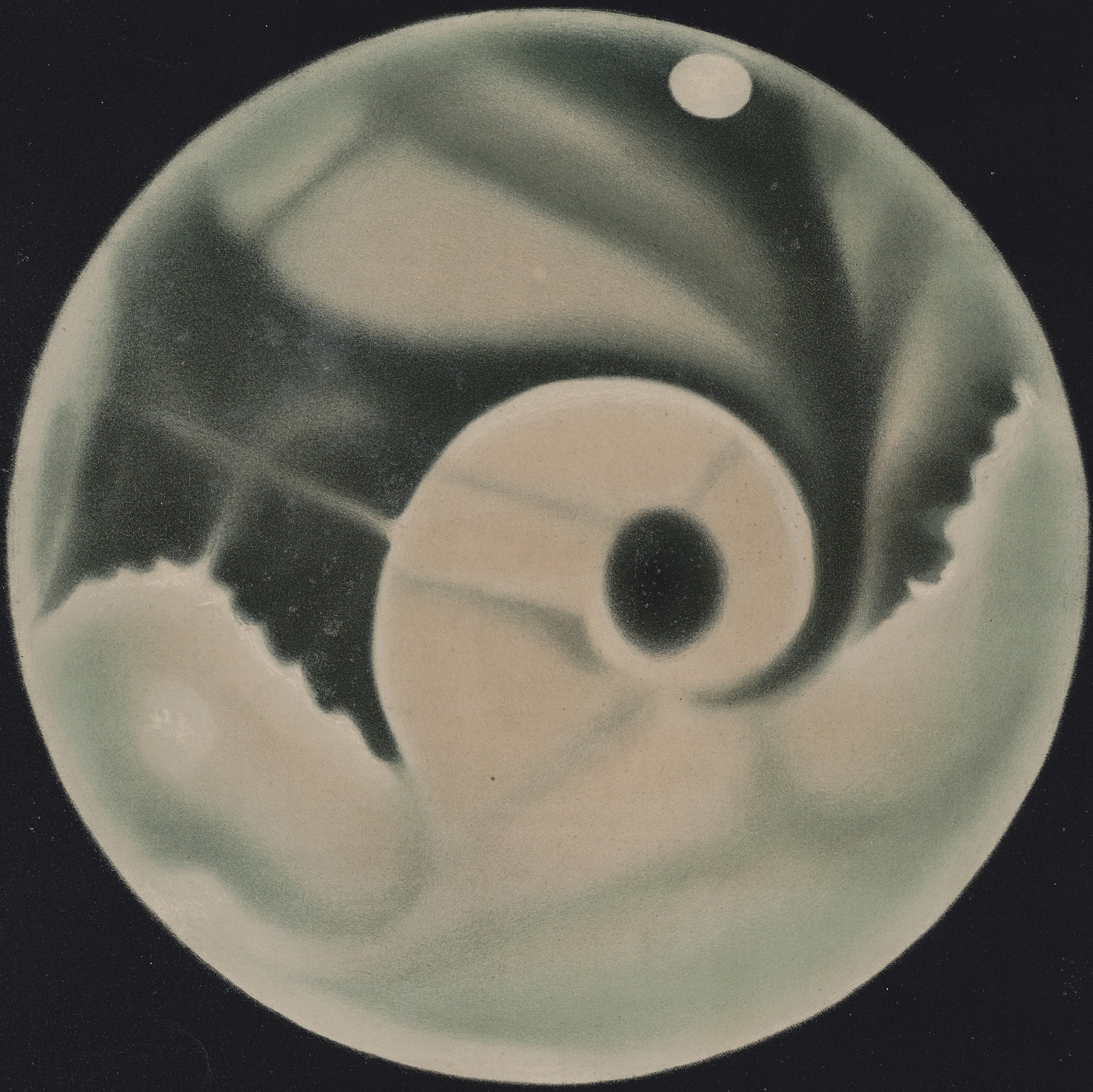
The French-born Étienne-Leopold Trouvelot was a talented astronomical observer and artist who worked with the Harvard University observatory. Detailed observation of celestial phenomena, from sunspots to the planets, was at the time quite precise; Trouvelot’s specialty lay in combining multiple drawings of his observations into single, large images that he claimed were the result of just one observation at a very precise time [Cat. 43, Cat. 44]. Trouvelot prepared the chromolithographic printing surfaces himself; his visualization of a partial eclipse of the moon illustrates the incredible precision in the varied tones and hues that can be achieved with chromolithography [Cat. 44]. Trouvelot published a portfolio of fifteen of his large-format visualizations in 1881, explaining them in his 1882 companion publication, The Trouvelot Astronomical Drawings Manual.14
Yaggy was not the only publisher to apply chromolithography to visualize human anatomy. In Leipzig, Friedrich Eduard Bilz created a set of twenty fold-out anatomical diagrams, each in nine colors, for his The New Natural Method of Healing: A Golden Guide to Health, Strength and Old Age (Leipzig, 1898); Bilz claimed to have sold over two million copies of his work of alternative medicine in several languages in just three years.15 As the figures unfold, they progressively reveal different layers of anatomy. The effect can be seen from a reprinting of Bilz’s images in Paris in 1900 as Le corps humain (“the human body”) [Cat. 58].
Other chromolithographic posters visualized political matters. While many of the posters advertising US government bonds during World War I were relatively crude, several were especially successful in creating intimate portraits of what was at stake in US participation in the war to convince those on the home front to help fund the war effort. Cat. 47 references the atrocities inflicted on civilians by bloody-handed German soldiers during the war, known as the “rape of Belgium,” and imagines a heroic US soldier interceding on the side of humanity. Cat. 48 and Cat. 49 are both more realistic about the sacrifice of US lives to ensure that liberty will continue to reign.
The founder of the Salvation Army, William Booth, issued a poster which was also used to illustrate his 1890 tract, In Darkest England and the Way Out, about how to cure the evils associated with industrialism and the burgeoning urban poor [Cat. 45]. Reading upwards from the bottom, members of the SA rescue the urban poor from the flood of iniquity (starvation, betting, unemployment, drunkenness, etc.) and give them succor before passing them into “the city colony” to learn skilled trades and to restore their morality, before perhaps passing up to “the farm colony” of domestic settlement or onto the “the colony across the sea.” The poster makes a compelling image.
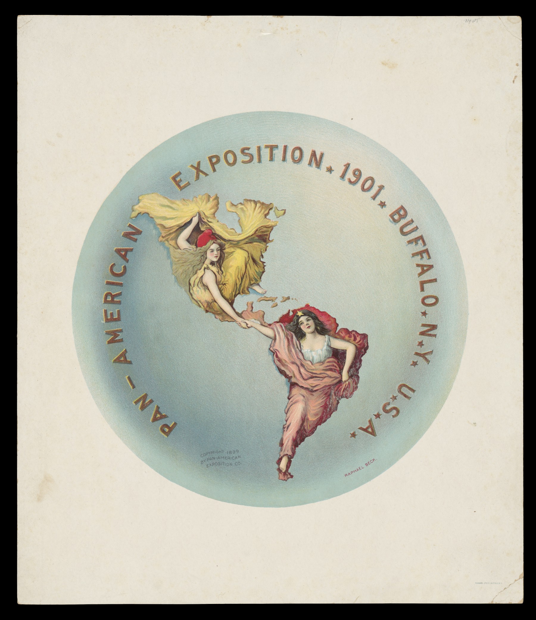
Even more so was a remarkable image published in Minneapolis in 1895, which seems to have been the only work published by Emerald Publishing and its owner, Chris Gallagher. “God Save Ireland” [Cat. 46] is in some respects the political opposite of Booth’s paean to colonial settlement. Gallagher instead depicts the atrocities perpetrated by the British on the Irish and argues for US aid to Irish revolutionaries; at right, Columbia offers the sword of revolution to Ireland, and Ireland’s fetters fall away. It’s a powerful image, subtly reinforced by the use of globes to suggest the new world helping the old towards independence, national self-determination, and democracy.
As noted above, in discussing Levy Yaggy’s works, the later nineteenth-century was an era in which human and environmental worlds were seen as intimately intertwined and, more particularly, in which the environment shaped and determined human societies and cultures. These presumptions are made plain in two further works that combined maps with the visual potency of chromolithography’s verisimilitude.
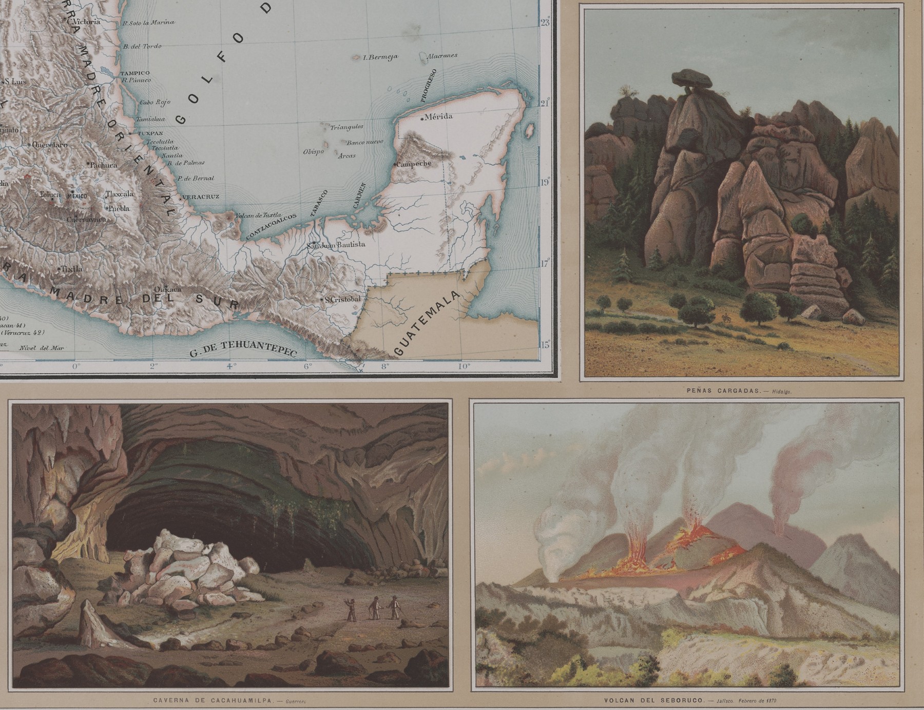
The Mexican geographer Antonio García Cubas had made the first atlas of Mexico in 1858, in which he mapped the country’s geography, state by state, using hand-colored lithographs (OML 15104).16 Some three decades later, he produced another atlas of the country—a “picturesque atlas” as the title put it—showing multiple aspects of the country [Cat. 51]. Each of the atlas’s thirteen plates has the same graphic structure: a map of all of Mexico is placed at its center, depicting a specific theme, surrounded by a wide border composed of many portraits and vignettes. The four maps in the exhibition depict the country’s physical relief (pl. VI), hydrography (pl. VII), agricultural practices (pl. VIII), and history and archaeology (pl. X). In respect to the last, García Cubas subscribed to the contemporary political rhetoric that sought to ground contemporary Mexican society in the great pre-Columban Aztek empire as much as in its physical environment. Chromolithography gives each vignette a realism that seems to result from direct and careful observation. The result is a complex visualization of the physical, historical, and cultural character of the Mexican nation, deeply rooted in the pre-Columbian Aztec past.17
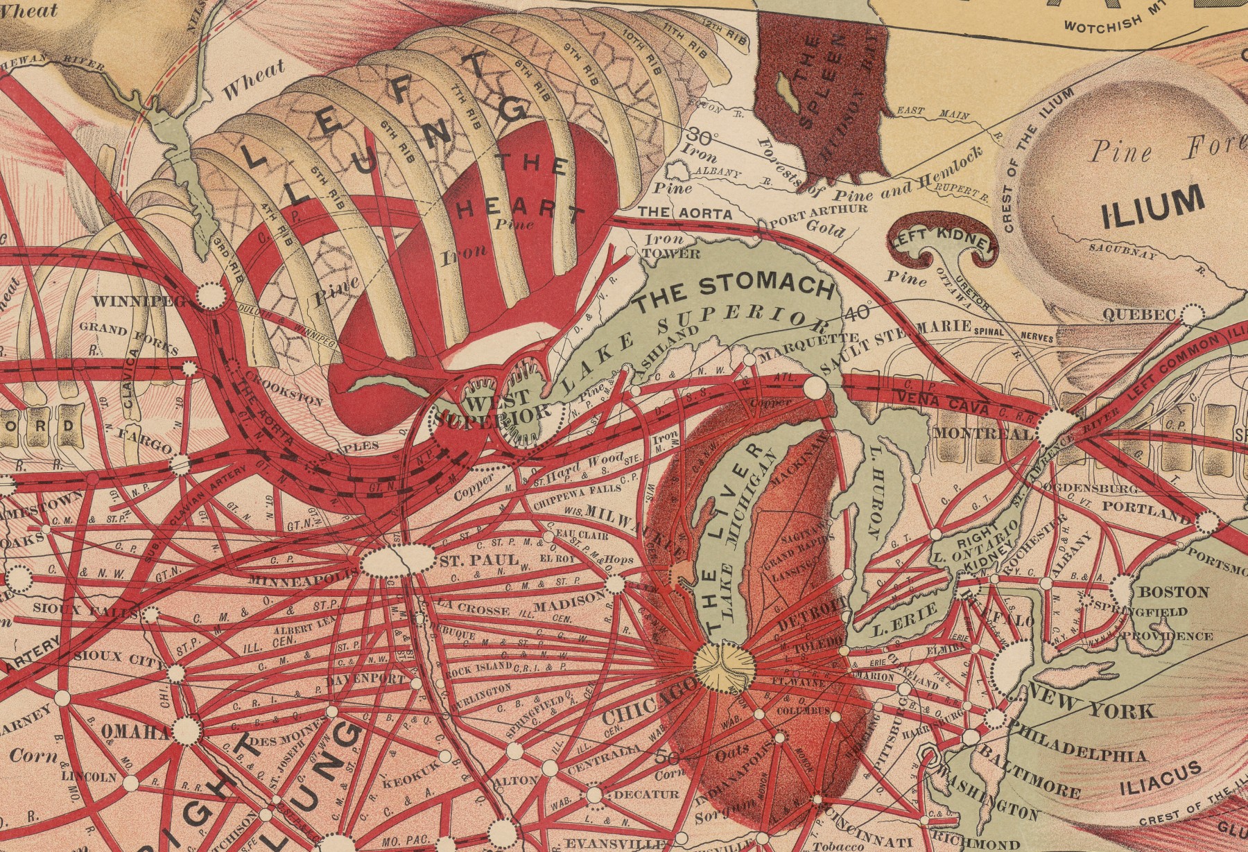
The social and the environmental came together in an extraordinary map created in 1889 by the big Chicago map publisher, Rand McNally, for a small company seeking to promote investment in West Superior, Wisconsin [Cat. 59]. The Man of Commerce superimposes a human figure, anatomized to show the arteries and many organs, over a map of North America and the Atlantic and Pacific Oceans. The routes of commerce (arteries) reach from Europe and across the US railroads and into the Pacific. The literal heart of this grand economic network was West Superior itself (fig. 43). The map relies for its effect on the widespread contemporary analogy drawn between societies and organisms. As the explanation at lower right states, “As brain power moves man, so the precious metals are the basis of commercial movement, and they are located in the head” (placed in the Rockies and California, with their many gold and silver mines). Furthermore, studying the map “will convince the student that there is a most wonderful analogous resemblance between the development of commerce in North America and the anatomical development of man.”
Popular Visualizations
Chromolithography was used extensively for cheap, colorful images that might appeal to popular audiences. One way in which the outpouring of images coincided with geography was in educational games: jigsaws, racetracks (modern variants of “the game of the goose”), and other board games. The box covers, game boards, and even the pieces or counters were attractively printed with chromolithography [Cat. 52, Cat. 53, Cat. 54, Cat. 55, Cat. 56, Cat. 57]. The designs on the box covers reflected the theme of the particular games. The cover to the racetrack-style Game of Round the World with Nellie Bly [Cat. 52] depicted the journalist Elizabeth Cochrane Seaman, penname Nellie Bly, tripping across the globe; in 1889, she traveled around the world in just 72 days, beating by a resounding eight days Jules Verne’s character Phineas Fogg in Around the World in Eighty Days (1873). The Game of Travel [Cat. 53] had a medley of exotic pictures on its cover. Other covers were rather generic, although they could express contemporary ideas of racism and empire [Cat. 54].
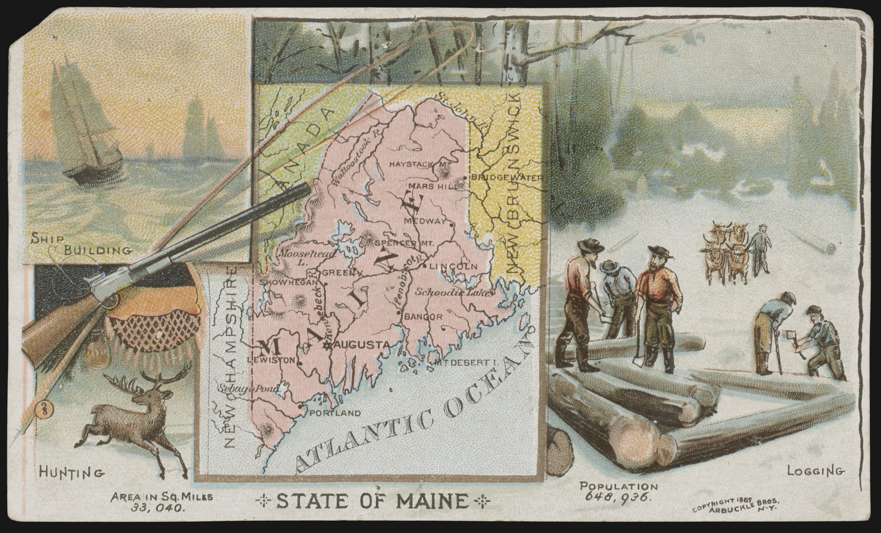
To entice consumers, cigarette and bubble-gum manufacturers have famously added collectible cards to their products. In 1889, Arbuckles Coffee followed suit with one hundred map cards: fifty maps of the US states, and fifty maps of countries around the world. The cards could be collected individually [Cat. 62, Cat. 63, Cat. 64, Cat. 65] or one could purchase the two sets as atlases [Cat. 60, Cat. 61]. Each card gave a map of the particular region together with some information about its size and population and vignettes of stereotypical commercial endeavors.
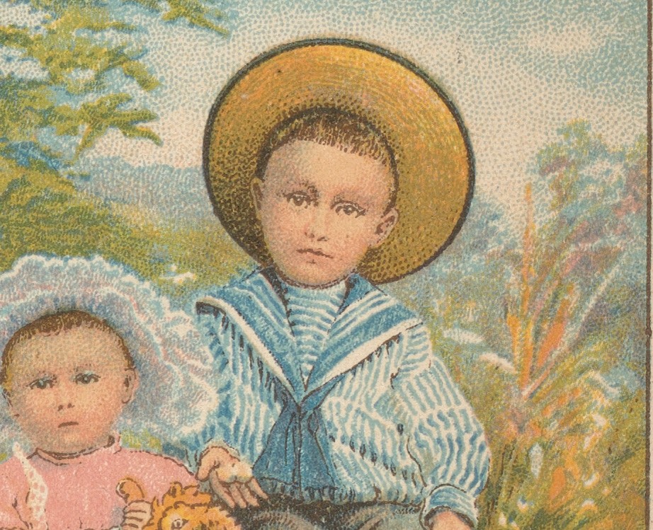
Many other kinds of businesses used small trade cards to advertise their services. OML has a large collection of such cards, most of which were printed in monochrome or in just a few colors. But those that included pictures were inevitably produced by chromolithography so as to possess the necessary realism [Cat. 66–91]. The subjects of the trade cards included scenic hotspots, particularly Niagara Falls, the services offered by railroads (smoking cars, and the like), new machinery, and so on. These small works stand in marked opposition to the large display pieces, but they demonstrate just how pervasive were the realistic chromolithographic images that brought visions of the spectacular world into the lives of everyone in America.
Notes
-
Marzio, Democratic Art. See also Twyman, History of Chromolithography. ↩︎
-
Twyman, History of Chromolithography, 125–84 (to 1860), 185–268 (after 1860). Pragmatically, there is little need to reproduce many images within this section as the gallery of exhibition items is just a few pages away. ↩︎
-
Twyman, History of Chromolithography, 591–618 ↩︎
-
E.g., Last, Color Explosion, 4, limited “chromolithography” to the “reproduction of art images” that were often of “low-quality, mass-produced work.” He referred to other, less artistically crude works produced with the same technology as “color lithographs.” ↩︎
-
OML acquired Audsley’s book already disbound, specifically so that individual plates can be displayed. ↩︎
-
Twyman, History of Chromolithography, 63. ↩︎
-
Yaggy’s Geographical Study: Comprising Physical, Political, Geological and Astronomical Geography (Chicago: Western Publishing House, 1887). Henry H. Rassweiler, Teacher’s Hand Book: Designed to Accompany Yaggy’s Geographical Study (Chicago: Western Publishing House, 1888). ↩︎
-
David Woodward, “Medieval Mappaemundi,” in Cartography in Prehistoric, Ancient, and Medieval Europe and the Mediterranean, ed. J. B. Harley, and David Woodward, vol. 1 of The History of Cartography (Chicago: University of Chicago Press, 1987), 286–370, esp. 300. ↩︎
-
Federico Ferretti, “‘They have the right to throw us out’: Élisée Reclus’ New Universal Geography,” Antipode 45, no. 5 (2013): 1337–55. ↩︎
-
Levy Yaggy, Yaggy’s Geographical Portfolio (Chicago: C. F. Rassweiler & Co., 1893). ↩︎
-
Reps, Views and Viewmakers of Urban America, 159. ↩︎
-
Reps, Views and Viewmakers of Urban America, 30, barely discusses chromolithography and then primarily (30n29) to argue that a view identified by Marzio in Democratic Art as having been produced by chromolithography was actually a tinted lithograph. ↩︎
-
See, e.g., Dona Brown, Inventing New England: Regional Tourism in the Nineteenth Century (Washington, DC: Smithsonian Institution Press, 1995). ↩︎
-
The portfolio, published in New York by Charles Scribner’s Sons in 1881 was untitled. Étienne-Léopold Trouvelot, The Trouvelot Astronomical Drawings Manual (New York: Charles Scribner’s Sons, 1882). ↩︎
-
Twyman, History of Chromolithography, 254–55. ↩︎
-
Magali M. Carrera, Traveling from New Spain to Mexico: Mapping Practices of Nineteenth-Century Mexico (Durham, NC: Duke University Press, 2011), 144–83. ↩︎
-
Carrera, Traveling from New Spain to Mexico, 184–231. See also Raymond B. Craib, Cartographic Mexico: A History of State Fixations and Fugitive Landscapes (Durham, NC: Duke University Press, 2004), 19–54. ↩︎