In the 1790s, as commercial map printing took off in the young USA, all printed maps were impressed from copper plates. But copper is relatively soft and wears out quickly in high-pressure rolling presses; copper plates could not be used for more than one or two thousand impressions, at most.1 The process of printing copper plates was also a comparatively slow process. The technology continued in use by map and atlas publishers in New York, Philadelphia, Boston, and elsewhere, but it simply could not keep up with the rapidly rising demand for cheap printed materials generated by industrialization and compulsory primary education.
In the 1830s, map printers discarded copper engraving almost entirely in favor of newly developed printing technologies that could sustain large print runs, fast production rates, and low costs. Technological experimentation was rife, and variations in technologies common. The result was a bewildering proliferation of new printing techniques; only the basic technologies are discussed here.
Lithography is the most famous of the new printing techniques, and in its multiple implementations it would come to dominate all commercial and most art printing through the twentieth century (before the rise of digital technologies). Other techniques important for map printing were typographic map printing, steel-plate engraving, wood engraving, and cerography (“wax-engraving”). The new technologies were further complicated by the application of photographic techniques to transfer words and images to printing surfaces and by the adaptation of each technique to printing multiple colors.
Most of these technologies appear in the following discussion, except for steel and wood engraving. Steel-engraving, used in the USA and Europe for high-end reference atlases, was in principle akin to copper engraving, only using a much harder matrix; if steel-engraved maps were colored, then it was by hand. Wood engraving used strong knives to cut into the hard end grain of blocks of wood; when printed like any other relief block, the result was an inverted image of white lines against the printed black, that might be hand colored. Wood engravings were duplicated for reprinting by stereotyping, which in this context means making a relief printing surface in metal from a mold formed from the wood engraving.
Unsuccessful Color Printing Processes of the Early Nineteenth Century
One early nineteenth-century approach to printing maps in color was to combine woodcuts with typographic map printing. The latter was a later eighteenth-century German creation in which individual pieces of type were cast not with letters and punctuation but with pieces of lines of various shapes. A map constructed from such type could be printed from a regular letterpress.2 Benjamin Dearborn, a Boston printer and mechanical inventor, in 1814 produced a printed color map of the Charles River just upstream from Boston, showing plans to erect a series of large tidal mills Cat. 6.
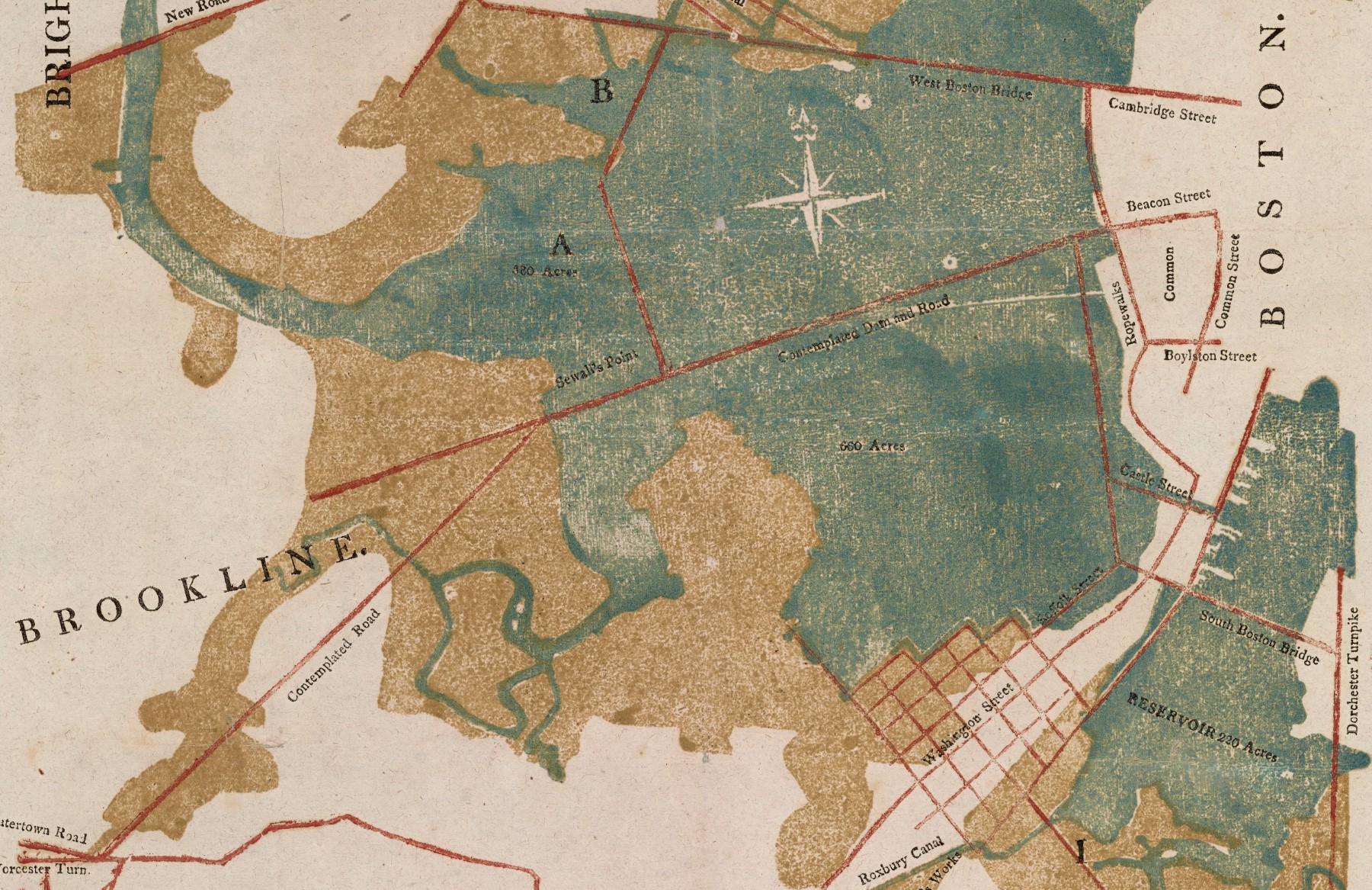
As the detail in figure 20 indicates, Dearborn used two woodblocks to print areas of water (blue-green) and salt marshes that might be drained and reclaimed (brown) around the Charles River. The third printing was of regular type in black, for the print place names. Finally, he added a fourth printing in red of a series of straight lines for the roads and causeways. Technically speaking, Dearborn did not set the red lines from individual pieces of type; the lines are too regular and smooth. He likely made a mold for the lines from which he created a relief surface. Overall, the four colors were rather well registered, probably because Dearborn had also invented a new letter press on which he printed the map, but the technique seems to have been too complex to catch on.
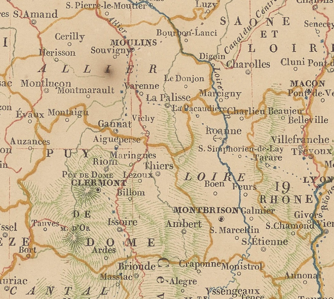
A few years later, in 1823, Joseph Langlois designed a multi-colored printed map of France to advertise the kind of carte typo-géographique that the company Firmin Didot sought to popularize Cat. 7.3 Areas of color were printed from woodcuts and letters from regular type. That all the lines were printed from individual pieces of map-type is evident from their stuttering form (fig. 21). An advertising piece, Langlois’s map includes an explanation of the sequence in which the colors were printed:
- blue (woodcut) for features of the first class: the seas and rivers that empty into the sea; very high mountain peaks (5500+ m); major roads
- red (type) for the second class: tributaries of the blue rivers; next tier of mountains (4500–5500 m); lesser roads; and (unspecified) the lines of latitude and longitude
- brown (type) for third-class features: tributaries of the red rivers; lesser mountains; still lesser roads
- dark green (type) for fourth-class features: tributaries of brown rivers; lesser mountains; some lesser roads
- light green (woodcut) for extensive areas of lower mountains
- yellow (woodcut) for foreign countries and the boundaries of départements and military divisions
- black (type) for placenames.
At about the same time, an Austrian engineer proposed a very similar process mixing woodcuts and typographic lines to make large-scale topographical maps.4 The results were effective en gros, but the typographical linework was perhaps too crude to be accepted either by the public or by military officers.
A rather different approach was taken in London by the printer George Baxter. To achieve complex color prints that captured the look of oil paintings, he began with the base of a monochrome aquatint engraved in copper, steel, or zinc,5 and then overlaid up to twenty different colors printed from wood blocks, using oil-based inks throughout; he patented the process in 1834. While the results were attractive and greatly appreciated, Baxter’s technique was slow and costly; ultimately it proved idiosyncratic and was not taken up.6
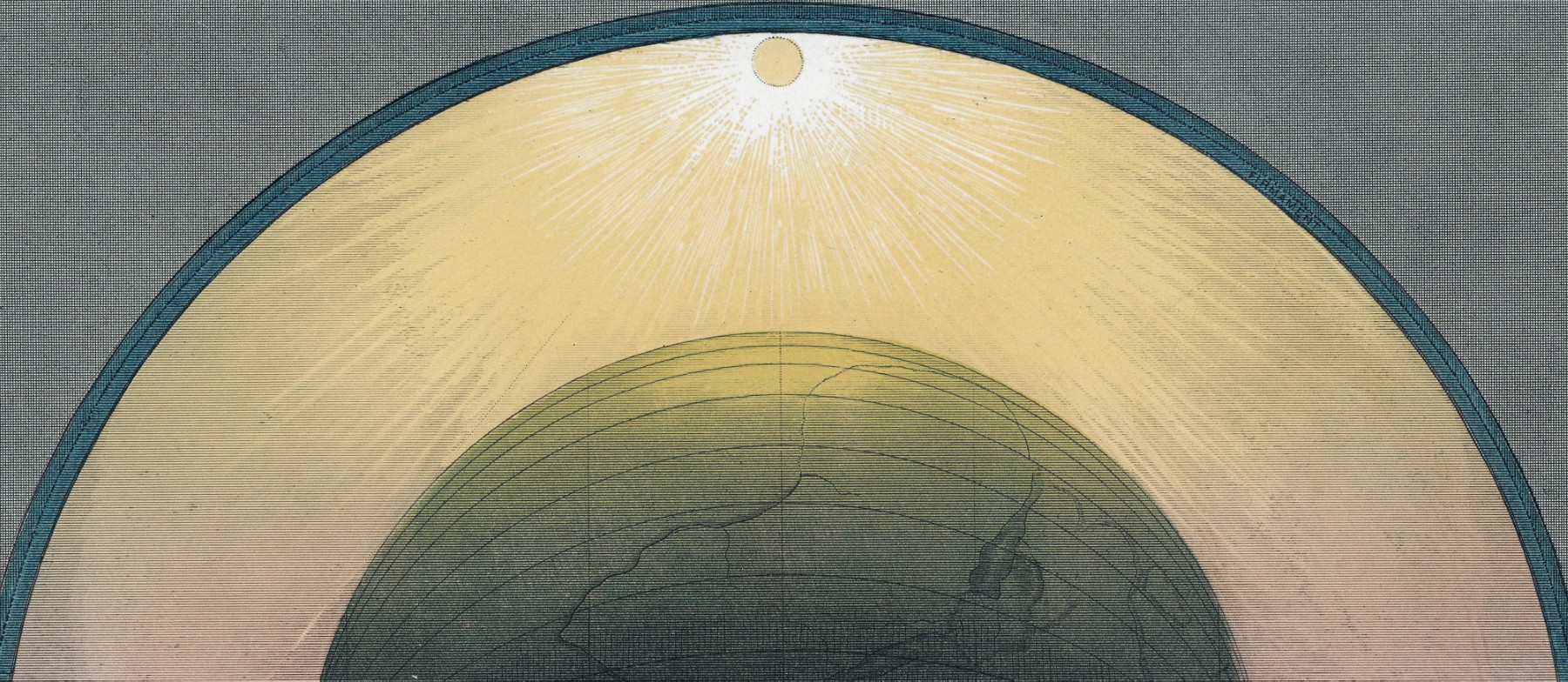
One application of Baxter’s technique was the preparation of eleven plates to illustrate Isaac Frost’s Two Systems of Astronomy of 1846 [Cat. 8, Cat. 9, Cat. 10; OML 50187–92]. A member of a puritanical sect founded by Ludovic Muggleton in the later seventeenth century that read the Bible literally, Frost had been struck by the public lectures of astronomers that were dramatically illustrated with the new technology of hand-painted lantern slides: although they called themselves Christians, Frost complained, the astronomers had evidently abandoned the Bible’s teachings of the nature of Creation. In presenting the “two systems” of astronomy—the flawed Newtonian and the Biblically correct Muggletonian—Frost used Baxter’s complex images to emulate the lantern slides and appeal to modish technology (fig. 22).7
Cerography
Cerography is also known as wax-engraving or as the oxymoronic “relief map engraving” Cat. 1. It entails a complex electrochemical process that creates a relief printing surface in copper or nickel. Essentially, a thin copper plate, or “case,” serves as a foundation, which is then covered in wax. The wax is scored through, to expose the copper, in the required right-reading design; when the design is complete, the wax is covered in powdered graphite. The case is used as the negative electrode in an electrolytic solution: depending on the solution, copper or nickel is deposited over both the case and the graphite to form a shell; the shell forms a thin sheen over the wax, being slightly deeper where it fills in the scored lines. When complete, the shell is carefully separated from the case and the wax removed with boiling water, leaving a thin, wrong-reading relief surface, or electrotype. Once finished, and backed to make it more robust for printing, the electrotype can be printed directly. Usually, however, the original electrotype was protected from damage by having a mold taken from which a more durable, relief printing surface could be cast; indeed, multiple printing surfaces could be cast to permit the simultaneous printing of the same image on multiple presses.8
Variants of this basic technique were developed by several people on both sides of the Atlantic. In the US, Sidney Edwards Morse coined the term “cerography” in 1839 and used the process for a number of atlases in the 1840s (fig. 23).
From the start, it was easy to print color, as long as care was taken in setting up the key image on the wax at the start of the process. However, the heat of the wax removal and then of backing the shell with solder meant that the shell could expand and contract in an inconsistent manner, degrading the ability to keep colors in register. Most color-printed cerographic maps reveal at least small registration problems (fig. 24). On the other hand, it was easy to form areas of hatching for shading from equally spaced lines ruled through the wax. Even more important, it was very easy to do lettering: regular foundry type could simply be stamped into the wax, whether as individual letters or as entire words. Cerography thus sustained a very dense placement of type and a distinctive aesthetic; the density and form of the lettering makes cerographic prints easy to identify.
The ease of lettering dramatically reduced costs: one estimate suggested that maps that would have cost $5–10 when printed by other techniques, cost just $0.25–1 when reproduced through cerography. Little used in Europe, US publishers came to use cerography widely to meet the high demand for cheap printed products that integrated maps into text, from atlases and encyclopedias to guidebooks and railway maps. Sporadically used through the 1860s, especially by printers in Buffalo, NY, the technique began to take off in 1872, when it was adopted by Rand McNally in Chicago. Between 1880 and 1940 cerography was the method for commercial map printing in the USA.9
Lithography and Hand Color
A greatly significant innovation in printing technology was made after 1796 by a German actor and playwright. Seeking a cheaper way to publish his works, Alois Senefelder thought that he might use blocks of limestone from the quarry at Solnhofen, Bavaria, whose consistently fine-grained character seemed to make it amenable to being worked into a printing surface. Senefelder first thought to apply a greasy, acid-resistant ink to the surface of a limestone block to form a design; he might then etch away the unprotected surface to create a relief printing surface. This did not, however, prove feasible. Yet Senefelder soon discovered that the same greasy ink could hold onto printing ink that was otherwise readily washed off the bare stone surface; the result would be an inked surface ready to print (fig. 4 RIGHT).10
The result was the chemical rather than mechanical process of “lithography,” literally “writing on (or with) stone.” It is called a “planar” printing process because the printing surface is smooth and flat. “Lithography” has persisted as a generic term for planar printing processes, even when zinc plates caught on rapidly after the 1840s as the matrix for the printing surface; “zincography” seems to have been widely used in commercial US establishments after 1865. In contrast to the relatively thin and sturdy zinc plates, lithographic stones are brittle and so must be thick to withstand the necessary pressure of printing. Cat. 50 gives an idea of the nature of the blocks of limestone used in lithography; the stone has been damaged.
In the simplest form of lithography, a wrong-reading design is drawn directly onto the stone surface with a greasy pencil; the ink is applied to the stone, sticking to the design but washed off elsewhere, ready to print. Senefelder also developed a method to draw a right-reading design on chemically treated “transfer paper”; when the paper is placed design-side down on a lithographic stone, the (now wrong-reading) design can be transferred to the printing surface by simple pressure or by chemical means. Artists and printers soon developed other ways to transfer images to planar printing surfaces. Many different mechanisms were also developed to transfer photographs to stones, and several were used to reproduce maps in facsimile.11
At first, lithographic stones were printed by hand. The first successful steam-powered lithographic press was introduced only in 1851, permitting five to eight hundred impressions per hour, or about eight times the productivity of hand-powered lithographic presses. In 1904, the practice of offset lithography was commercially implemented: a right-reading image on the stone or zinc plate was printed onto a rubber blanket, from which it was transferred to paper; the process reduced wear on the printing surface and permitted different kinds of paper to be used. Offset lithography was quickly adopted as the process for printing books and remains so today.12
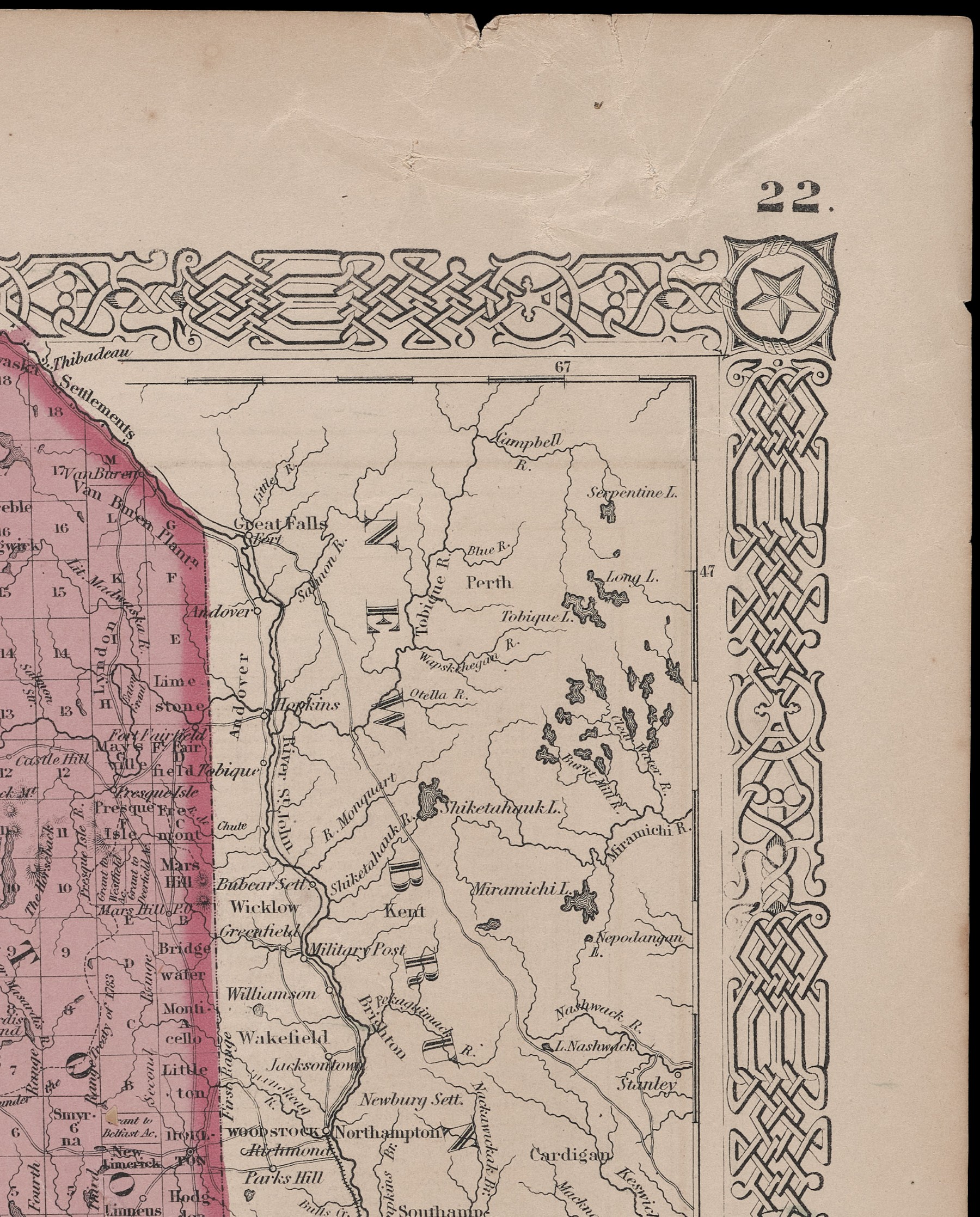
Printers soon found that it was easy to transfer freshly printed images to other planar printing surfaces. The planar printing surface became a place to mingle text with images with decorative devices, promoting a hitherto unknown complexity of layout. Lithography effectively promoted an early form of “clip art,” in which compound images could be built up directly on the printing surface from vignettes prepared or stored on other stones or plates. This practice could be as simple as adding a decorative border to a map (fig. 25) or as complex as assembling multiple elements into large wall maps (fig. 26).
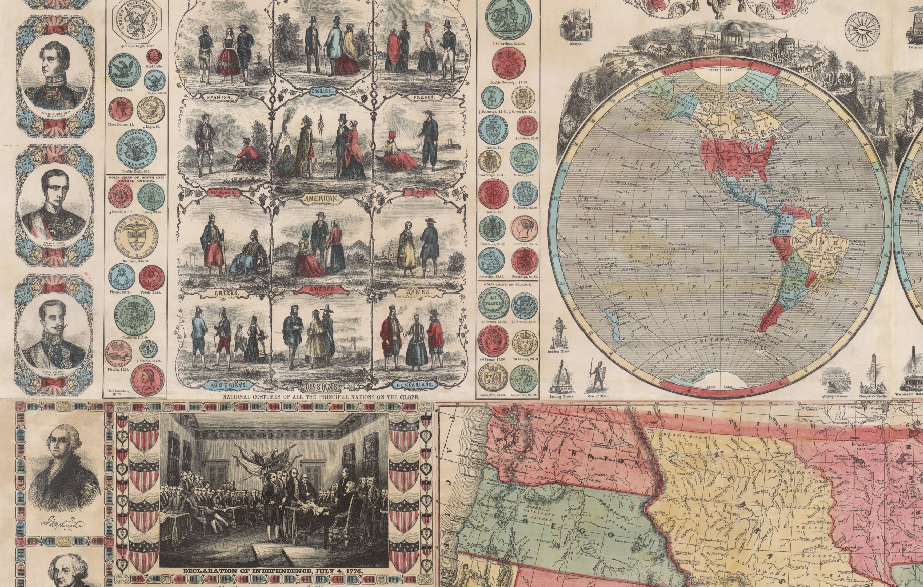
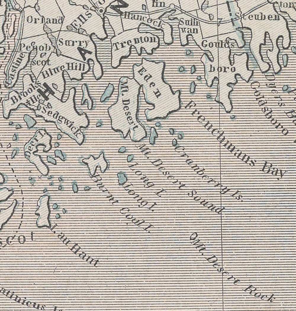
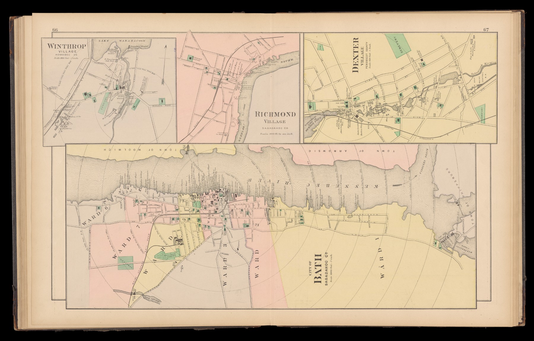
It was presumably possible to transfer a vignette to multiple stones for printing in multiple colors. Doing so, however, would require each transfer to be precisely positioned on each stone to prevent registration errors when printed. Overall, it was much easier just to assemble and print the compound image as a monochrome work and then to apply hand color if needed (as in figs. 25 and 26). For the nineteenth-century publishers in Philadelphia and New York who constructed images as collages on lithographic stones—ranging from wall maps of states, counties, and towns in the 1850s to state atlases in the post-Civil War era, to Sanborne fire-insurance maps of particular towns after 1900—it remained common practice to produce them as monochrome prints that might then be colored by hand (fig. 27).13
Color Lithographic Printing
For designs created in toto, however, it was relatively easy to print them in color with lithographic techniques. Several techniques were developed and used.14 What all had in common was the use of a “key”: the final, intended design expressed only in outline, rather like the “wireframe” or “outline” view in present-day digital drawing packages [Cat. 28, pl. 1]. The key is transferred to the surface of each printing surface, one per color; the lines of the key drawing are used to fill in the areas of each color on the respective printing surfaces, after which all extra lines are removed from the stone, and the image printed with good registration.
One way to mark the developing sophistication of US lithographers is in the number of colors, and printing surfaces, they used in their compositions. Louis Prang, in Boston, began color printing in the 1850s with no more than four stones, but by the 1890s he was using up to 44 stones.15 At the same time, several distinct techniques were developed to build up the final image, each with a distinct aesthetic.
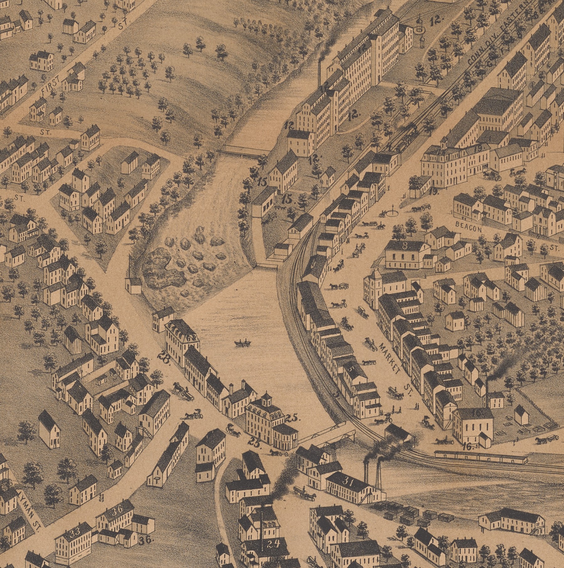
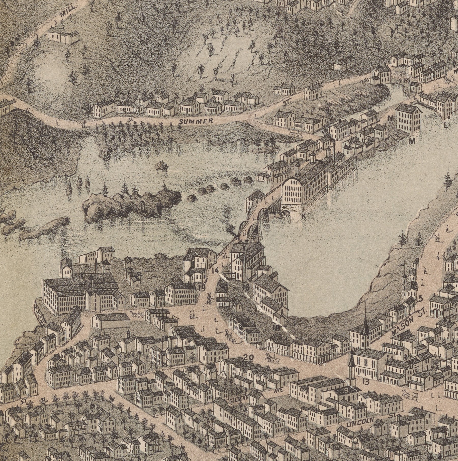
Perhaps the simplest form of color printing was the “tinted” lithograph, in which one or two colors were printed over a regular, monochrome foundation. Developed in England in the 1830s, the technique was introduced to the USA by immigrant craftsmen after 1840. It especially came to be used for the many bird’s-eye views of US cities and towns issued after the Civil War.16 Many of these views were printed in monochrome (fig. 28). But others were then overprinted with areas of light color, or tinting. The same artist and publisher who created and published the view in figure 28 also produced another view in the same year (1877) that had two tints, a blue wash applied over the river and a green wash to all the land other than the streets and to some of the walls of the buildings (fig. 29) [Cat. 11]. In Cat. 12, blue and beige washes were added to the black base image. The hallmark of the tinted lithograph is the use of just one or two broadly applied, lighter colors in addition to the dominant black image.
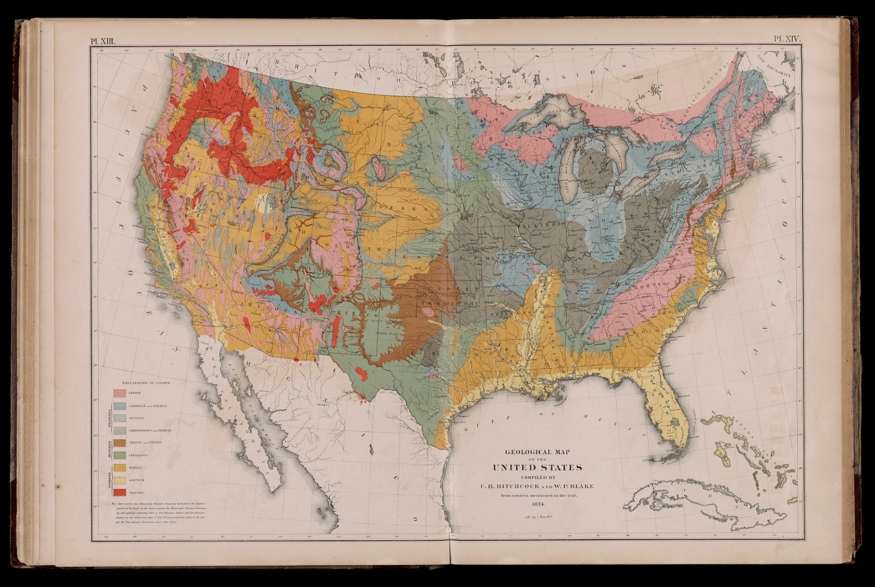
The first printed-color geological map was a tinted lithograph issued in Germany in 1820, in which a blue-green wash overlay the black linework to indicate areas of basaltic rocks associated with extinct volcanoes on the Eifel plateau. More complex maps of geological strata led by the 1840s to the printing of discrete areas of flat colors, one per stratum, over a black-line foundation, and without any overprinting of the colors (fig. 30). No precise term is accepted to label such prints, and they might be simply called “color lithographs” to distinguish them from other techniques [also Cat. 92]. Such maps are found increasingly through the nineteenth century especially in government documents and scientific reports.17
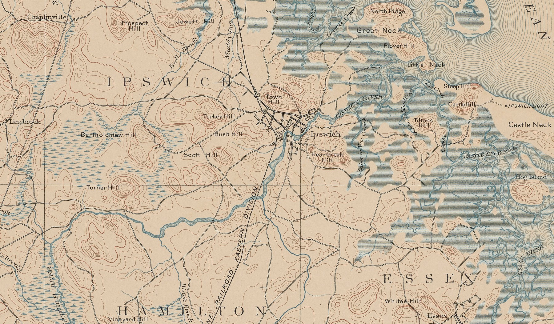
A further, relatively simple form of printed-color lithography was developed by the US Geological Survey (USGS) in the 1880s for its topographical maps [Cat. 13]. Henry Gannett, founder of the USGS mapping division, under the superintendency of John Wesley Powell, adapted the contemporary European practice of printing multi-sheet, state-wide, territorial survey maps from copper plates to the needs of the USGS. Specifically, USGS “topographical quadrangles,” covering one-quarter of a degree (15′) in latitude and longitude, were each prepared on three copper plates: water and water-related features, for printing in blue; contour lines showing hills and mountains, for printing in brown; and cultural features, such as buildings, roads, and place names, and for the marginalia, for printing in black. To prevent the master copper plates from wearing out, they were printed only for proofing and then to transfer the final designs onto lithographic stones to print the final maps in color (fig. 31). Once again, this process gives a distinctive look to the final maps: the design comprises only the lines permitted by copper engraving; shading, as for lakes and coastal waters, was achieved by thinly spaced lines. In the twentieth century, the USGS started adding further layers of color, prepared directly on lithographic stones, for areas of woodland (green) and for numbered state and federal routes (red).
Notes
-
This value increased as the copper plates were hardened with alloys and as knives similarly grew stronger; the value is a best guess for the early nineteenth century. ↩︎
-
Ingrid Kretschmer, “Typographic Printing,” in Cartography in the European Enlightenment, ed. Edney and Pedley, 1263–65. ↩︎
-
Woodward, Five Centuries of Map Printing, 116, 129. ↩︎
-
Franz von Hauslab, Versuche über die Anwendung der Lithographie für die Situations-Zeichnung (Vienna: Trentsensky, [1825]); my thanks to Wouter Bracke for the reference. See also Twyman, History of Chromolithography, 79–81. ↩︎
-
Aquatint was a process of etching a metal matrix to capture the tonal variation of watercolor washes in painting. Invented in the Netherlands in 1650, it was refined and popularized in Britain in the 1770s by the watercolor landscape artist, Paul Sandby. ↩︎
-
Burch, Colour Printing and Colour Printers, 124–34. Twyman, History of Chromolithography, 71–72. ↩︎
-
Isaac Frost, Two Systems of Astronomy: First, the Newtonian System, Showing the Rise and Progress thereof, by a Short Historical Account; the General Theory, with a Variety of Remarks thereon. Second, the System in Accordance with the Holy Scriptures, Showing the Rise and Progress from Enoch, the Seventh from Adam; the Prophets, Moses and Others, in the First Testament; Our Lord Jesus Christ, and his Apostles, in the New or Second Testament; Reeve and Muggleton, in the Third and Last Testament; with a Variety of Remarks thereon (London: Simpkin, Marshall, & Co., 1846). Francis Reid, “Isaac Frost’s ‘Two Systems of Astronomy’ (1846): Plebeian Resistance and Scriptural Astronomy,” British Journal for the History of Science 38, no. 2 (2005): 161–77. ↩︎
-
The complexities of the process are detailed in David Woodward, The All-American Map: Wax-Engraving and its Influence on Cartography (Chicago: University of Chicago Press, 1977), 50–81. ↩︎
-
Woodward, All-American Map, 24–49, esp. 31 (price estimate). ↩︎
-
Alois Senefelder, The Invention of Lithography, trans. J. W. Muller (New York: Fuchs & Lang Manufacturing Co., 1911), originally published as Vollständiges Lehrbuch der Steindruckerey (Munich: Fleischmann, 1821). ↩︎
-
Matthew H. Edney, “The Copy: Printing Processes and the Reproduction of Early Maps, 1830–1945,” Portolan 113 (2022): 48–63. ↩︎
-
Woodward, All-American Map, 9. Key works on the technique are Michael Twyman, Lithography 1800–1850: The Techniques of Drawing on Stone in England and France and Their Application in Works of Topography (London: Oxford University Press, 1970), and Michael Twyman, Breaking the Mould: The First Hundred Years of Lithography (London: The British Library, 2001). ↩︎
-
Broad overviews of the use of lithography for printing maps, albeit with a special focus on British territorial mapping, are Ian Mumford, “Lithography, Photography and Photozincography in English Map Production before 1870,” Cartographic Journal 9, no. 1 (1972): 30–36, and his “Lithography for Maps: From Senefelder to Hauslab,” Journal of the Printing Historical Society 27 (1998): 69–87. Unfortunately, Mumford’s excellent and highly useful doctoral dissertation has not been published: “Milestones in Lithographed Cartography from 1800” (Ph.D. dissertation, University of Reading, 1999). ↩︎
-
In general: Twyman, History of Chromolithography; Last, Color Explosion. For maps: Mumford, “Milestones in Lithographed Cartography,” 34–77. ↩︎
-
Larry Freeman, Louis Prang: Color Lithographer, Giant of a Man (Watkins Glen, NY: Century House, 1971), 13. ↩︎
-
Twyman, History of Chromolithography, 41¬–62. John W. Reps, Views and Viewmakers of Urban America: Lithographs of Towns and Cities in the United States and Canada, Notes on the Artists and Publishers, and a Union Catalog of their Work, 1825–1925 (Columbia: University of Missouri Press, 1984), 24–38, neatly summarized the introduction of lithography in the USA; see esp. 29–30 on what he called “tone” lithographs. ↩︎
-
Karen Severud Cook, “From False Starts to Firm Beginnings: Early Colour Printing of Geological Maps,” Imago Mundi 47 (1995): 155–72, esp. 155. Last, Color Explosion, 4, 18–21. ↩︎