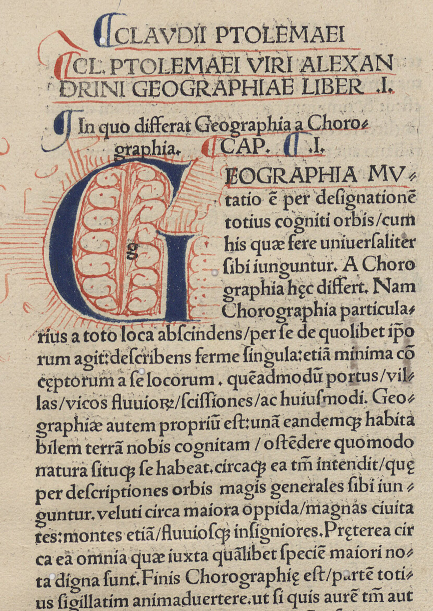
There was actually little need for early printers to print maps in color, given that the craft of illumination and coloring was already well-established. Just as graphic novels today are commonly drawn by one artist, lettered by another, and colored by a third, so too were ornate medieval manuscripts. Much early book printing sought to emulate the look of those manuscripts, for example leaving spaces for decorative initials to be added later by hand (fig. 16), and there rapidly developed a practice to color printed images so heavily as to obscure their origin as prints. That is to say, the cultural centers of Europe possessed colorists who could be employed to add further visual dimensions to monochrome printed maps by adding color by hand, generally using watercolors to do so.1
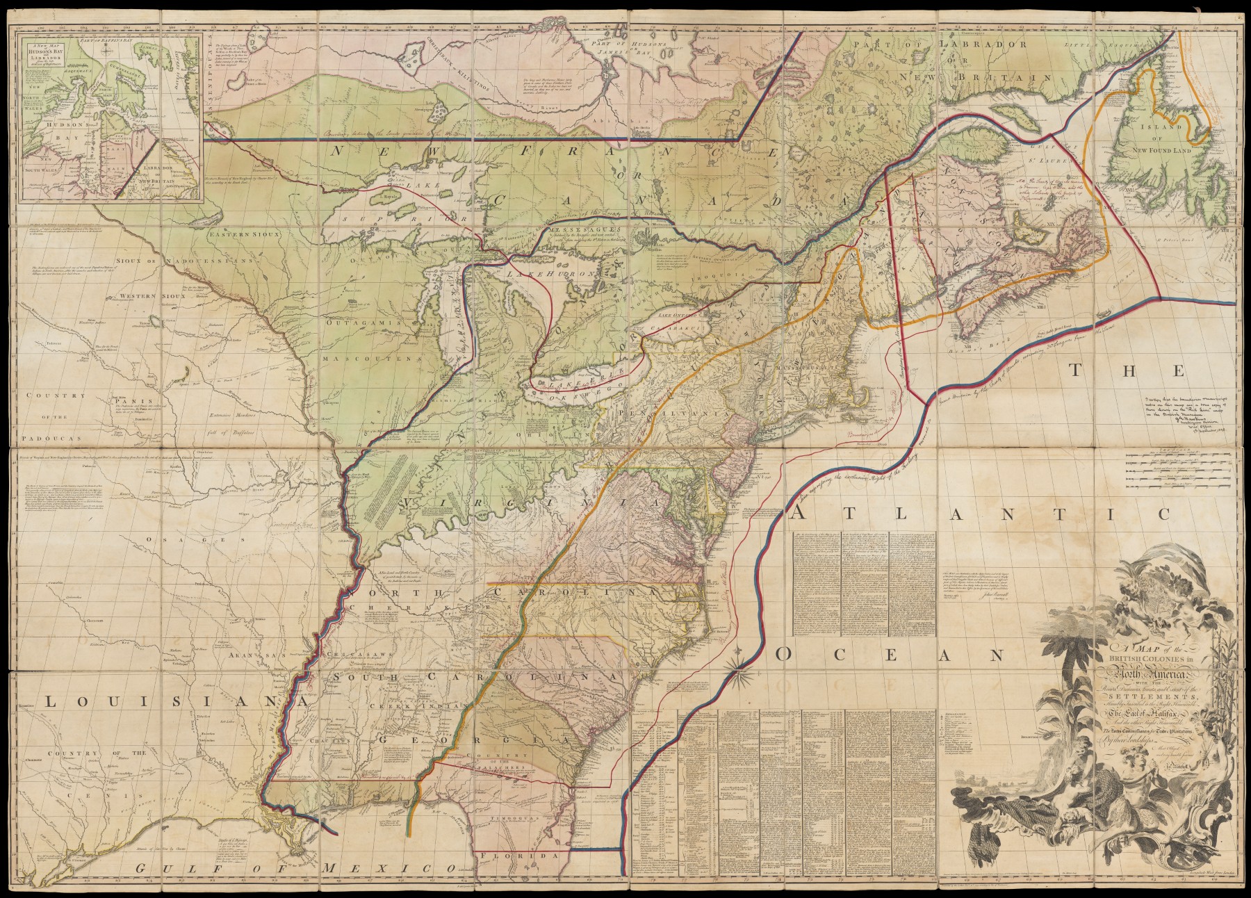
Watercolors might be applied to a printed map at any time. Maps might be sold already colored, usually at a premium (“publisher’s color”); an owner might subsequently have the map colored, either close to the time of production (“contemporary color”) or much later (“late color”). The rise of the trade in decorative early maps after 1918 meant that dealers also colored maps in their stock to make them more appealing to potential buyers as artistic works. Also, individual maps might have been colored at different times (fig. 17). It takes experience and a degree of connoisseurship to distinguish contemporary from late color. The only way to be sure that watercolor on a map is indeed publisher’s color is by identifying a number of impressions of the same map that were all colored in precisely the same way. Although generally associated with eighteenth-century map production, publishers used consistent coloring from the earliest decades of map printing.2 That color on a map was applied by the publisher is also apparent when stencils were used to simplify the application of each hue, specifically when the poor alignment of a stencil produces a registration error (fig. 18).
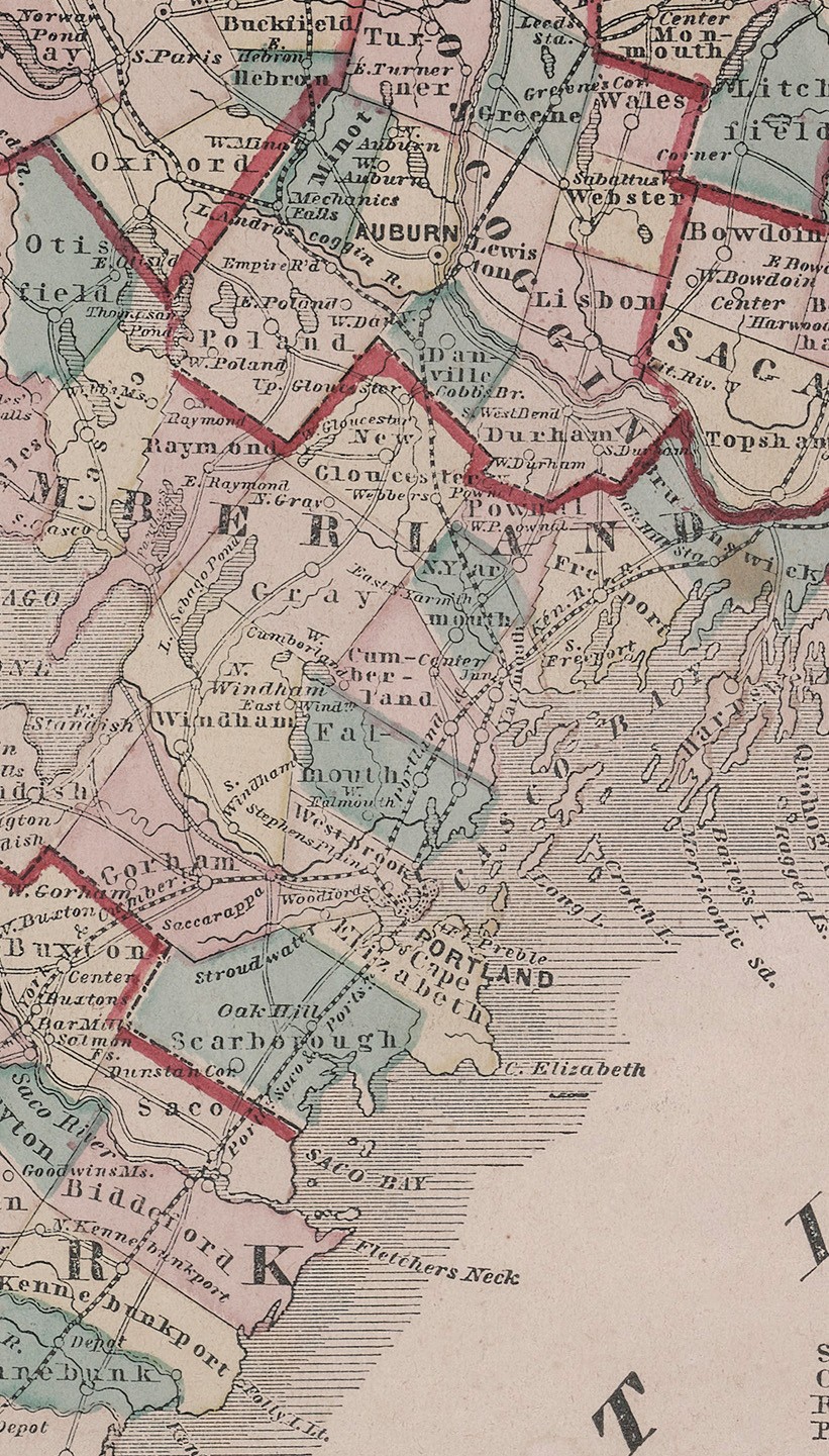
In recent years, map historians have started to appreciate that “color was so often an integral part of a map that it [should] not be dismissed as merely decorative.”3 As such, even with hand-applied color, “maps and their colours should always be studied in the context of society, geography and politics.” Even when the colors used might be highly variable and there is no standard “color code” (e.g., blue = water, red = towns), there are nonetheless rationales for selecting the phenomena to be colored (color “system”) and the manner of coloring them (color “scheme”).4 In figure 18, there is no code behind the color, no reason for the particular hues given to each town in Cumberland County, Maine, why Freeport and Cape Elizabeth are in yellow, Yarmouth and Falmouth in green, Pownal and Cumberland in pink, and Portland in grey. What is significant is the system (only political units were colored) and the scheme (towns colored in full, no two colors touching, counties with thick colored boundaries), which together presented the many towns as all unified and distinct political entities that together fill up the body of the state; areas beyond the state were left uncolored.
The hand-coloring of printed maps and other images continued as a common practice almost until the end of the nineteenth century, even as copper plates were replaced by other matrices and technologies [Cat. 1, Cat. 2, Cat. 3, Cat. 4]. The nature of the colorants was altered with the introduction of new chemical dyes; in Cat. 3, a varnish was also hand-applied to make some elements “pop.” Hand coloring remained efficient and cost-effective as long as low-paid women, children, and apprentices were available for piece work,5 and as long as the works had relatively low cultural value compared to works of art.
There seems no standard rule for which kinds of maps continued to be hand-colored through the nineteenth century. One category comprises specialized maps with low print-runs for small audiences, such as the detailed maps of urban places produced for insurance agents who assessed fire risks. General geographical maps constitute another. Not only do they not have to observe a specific color code (as fig. 18), but their content is mainly conveyed by the monochrome lines that make up the features and place names; moreover, the practice of creating maps on lithographic printing surfaces from multiple source images seems also to have deterred the use of printed color (see below). US commercial map publishers seem therefore to have been uninterested in investing in technologies for color lithographic printing. Hand coloring fell from use only as the cost of labor rose and as color printing became cheaper.
For maps made before 1800, the identification of the manner of coloring is easy: with very few exceptions, it would have been hand-applied; the exceptions would be apparent from multiple plate marks for copper engravings. But after 1800, as new techniques for printing color were developed, it can be hard to tell printed from hand-applied color. The easiest way is to look for the slight blobs, or changes in color density, and unevenness in application that are characteristic of an overloaded or lingering brush. Several blobs and inconsistencies are evident in figure 18, such as in the red county boundary between the towns of Scarborough and Buxton. The consistent offset in the application of the green coloring, when the red and yellow hues are not offset, indicates that these colors were applied with the help of a stencil. By contrast, the coloring of the same map’s vignettes seems to have been freehand. In figure 19, not only are there plenty of smudges, but the blue watercolor is not consistent in its relationship to the printed bounding line, variously not quite reaching the line, meeting the line, and going over the line.
Notes
-
Diana Lange and Benjamin van der Linde, eds., Farbe trifft Landkarte: Ausstellungskatalog / Colour Meets Map: Exhibition Catalogue, manuscript cultures, 16 (Hamburg: Centre for the Study of Manuscript Culture, Universität Hamburg, 2021), 49–110, explained the pigments used. See also Stillo, “Putting the World in Its ‘Proper Colour’”; Susan Dackerman, Painted Prints: The Revelation of Color (State College: Pennsylvania State University Press for the Baltimore Museum of Art, 2003). ↩︎
-
Van Duzer, “Colored as Its Creators Intended,” re the 1513 Strasburg Geography. ↩︎
-
Pedley, Commerce of Cartography, 67. ↩︎
-
Diana Lange and Benjamin van der Linde, eds., Maps and Colours: A Complex Relationship (Leiden: Brill, 2024), 1. Diana Lange, “Colour on Maps: Systems, Schemes, Codes,” Imago Mundi 74, no. 1 (2022): 117–24; Diana Lange and Oliver Hahn, Colours on East Asian Maps: Their Use and Materiality in China, Japan and Korea between the Mid-17th and Early 20th Century (Leiden: Brill, 2024), 4–13. ↩︎
-
See “Live Portraits, No. 3: The Map-Colorer,” Yankee Doodle 1, no. 11 (19 December 1849): 124. My thanks to Louis Miller for this reference. ↩︎