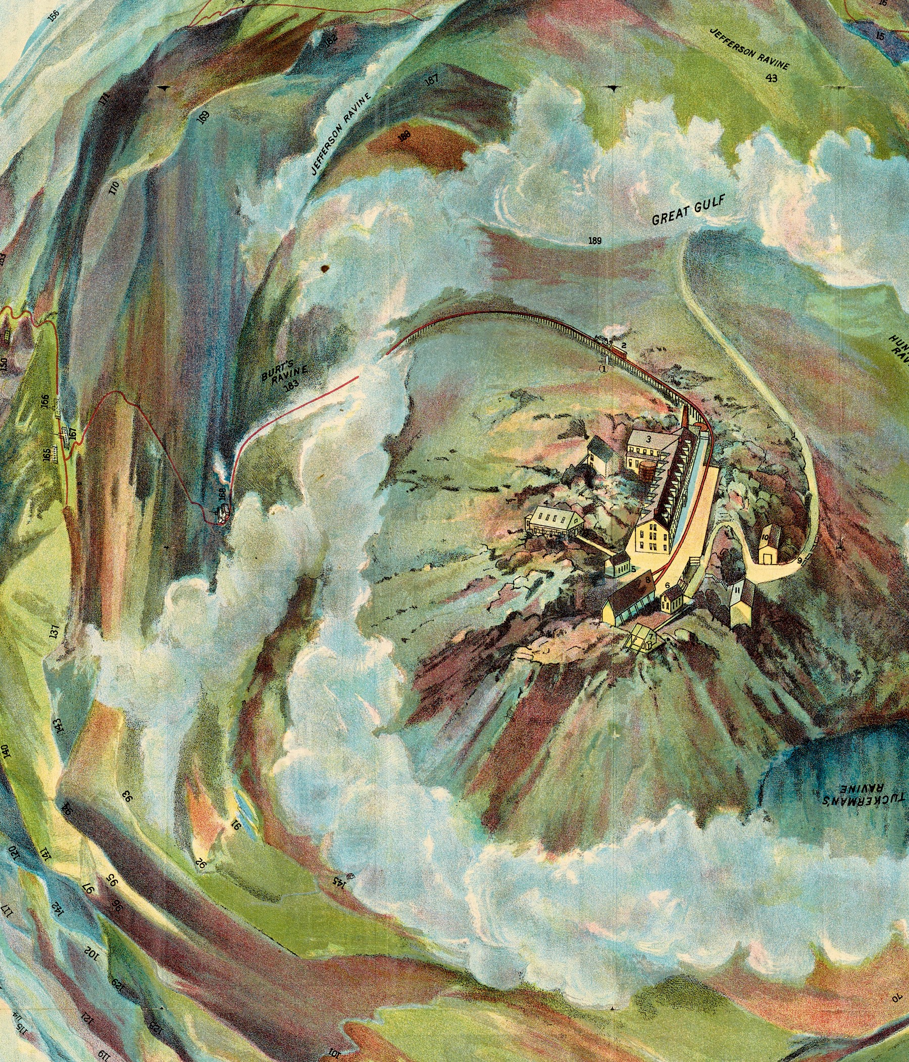
Figure 1 is a detail from one of the vibrant, visually complex, full-color images created in the later nineteenth century by “chromolithography”. This remarkable technology was developed to mimic the look of oil paintings, which it achieved by overprinting multiple colors in a carefully defined sequence to build up the final image. The technology was perfected by Godefroy Engelmann, who demonstrated its potential in a portfolio of images that he published in Paris in 1837, and it would be widely used in Europe and North America through the end of World War I (1914–18).
This colorful technology is not, however, generally associated with maps and mapping. After all, maps tend towards a more abstract, more linear, and less lush aesthetic. Yet, as figure 1 attests, at least some geographical and topographical images were printed by chromolithography. Indeed, Dr. Harold Osher once mentioned to me that he had a particularly soft spot for chromolithographic maps and views. I proposed the exhibition recorded in this catalog not only to honor Dr. Osher’s passion but also because I wanted to learn more about the technology and the images it was used to create. I did not know how chromolithography was used in mapping and related endeavors, nor how chromolithography’s application to mapping differed (if it did differ) from other nineteenth-century color-printing technologies. Curating an exhibition would be an excellent way to understand these matters.
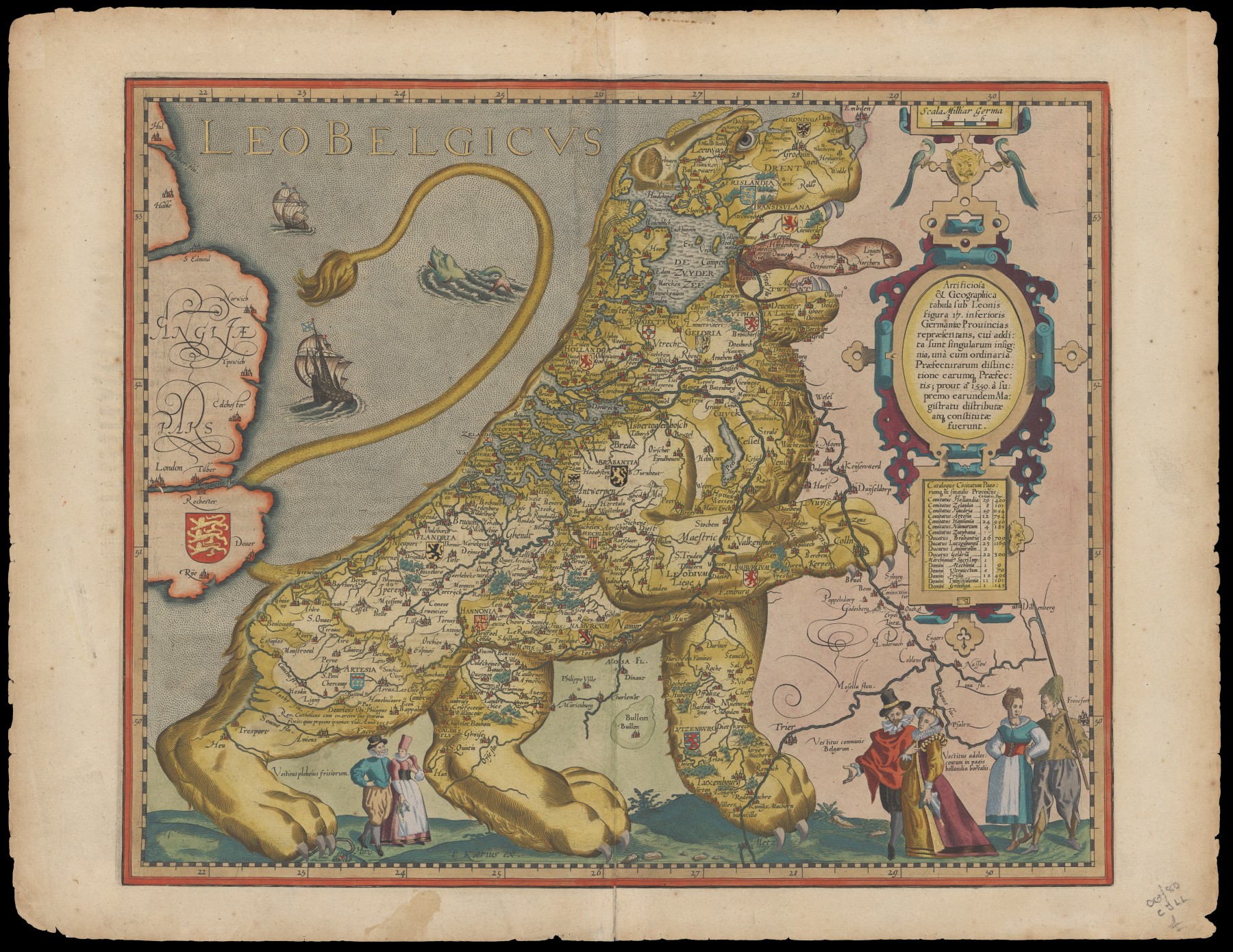
To be honest, map historians have paid little attention to matters of color. For the most part, they have been interested in the geographical information recorded in the black-ink lines and letters of both manuscript (hand-drawn) and printed maps. Color has therefore been of only secondary interest. After all, for the great majority of printed maps that map historians have traditionally studied, any coloring was done by the hand-application of watercolors. Moreover, the use of watercolors has seemed to be only for decoration and not for geographical function. For example, a search of the Internet for “Leo Belgicus 1617” generates many images of the map in figure 2. Although a few remain uncolored, most were hand-colored to bring out the form of the Nederlandic lion while emphasizing its constituent provinces; yet these maps were all colored in different ways, indicating that their coloring was added after the maps had been sold and was not part of the map per se.1 For the relatively few map historians who have considered the practices and technologies of map making, the coloring of maps by hand detracted from and even degraded the map maker’s intentions for their work.2
Even the rise in recent decades of interest in nineteenth- and twentieth-century maps that were printed in color has not led map historians to explore the intersections of maps, printing, and color in the European and American traditions. Several map historians have of course undertaken focused studies about how certain maps or kinds of maps were printed in color, yet there remains no overview of the subject. Certainly, there is no work I can point colleagues and students to when they ask about such matters. In preparing the presentation with which to open the exhibition, I found myself pursuing this broader perspective, and I have tailored this essay to serve as a first take at this much-needed overview.
I have necessarily relied on the many works about color printing by art historians and by historians of the book.3 These historians have of course focused on their own disciplinary concerns. As a result, they have discussed printing technologies as they were used in or for art but not maps,4 and they have tended to emphasize the creative and the artistic over the technical and the quotidian.
Historians have also been unclear about just what is meant by “chromolithography.” On the face of it, the word seems to refer to any printing of color (chroma in Latin) by means of a lithographic technology. When map historians have referred to chromolithography, it seems to have been with this generic meaning. For example, the classic history of map printing mentions “chromolithography” only briefly and then as a marker of the increasing sophistication of lithographic printing processes more generally.5 Art and print historians have tended to differentiate printing technologies according to the aesthetic qualities of the images produced. All have identified “tinted” lithographs as the unsophisticated if not crude products of an early adaptation of lithography to printing color. For more sophisticated color printing, however, historians have deployed a continuum of meanings for “chromolithography” that grades from generic color printing to Engelmann’s specific technology.6 I have found, as with other areas of confused terminology, that it is always clearest to use terms with specificity. So, chromolithography is used in this essay, as in the exhibition, in the strict sense of Engelmann’s technology of overprinting many colors.
In exploring the history of color and printed maps, this essay further explores an insight from early in my research for the exhibition, that the several different nineteenth-century technologies for printing color images were applied to maps in very particular ways. Each topographical map sheet published by the US Geological Survey, for example, was prepared on three copper plates that were transferred to lithographic stones to be printed in three colors; no one other than US governmental engineers used this system. Commercial map publishers used other forms of printing and coloring for their atlases and wall maps. By contrast, I found that the vibrant and colorful images produced with chromolithography were deployed in geography and related circles because they offered realistic visualizations and spectacular displays of the earth’s landscapes, peoples, and phenomena. Different kinds of mapping were sustained by different technologies. For geography and beyond, chromolithography established A Pageant of Spectacles.
This essay is based on the extensive collections of the Osher Map Library and Smith Center for Cartographic Education at the University of Southern Maine and as such it is a preliminary take on the wider topic. I do not address how Europeans deployed chromolithography in ways that differed from US practices, such as the technology’s use by some Swiss topographers for relief shading on maps of their mountainous terrain.7 Nor is it certain that OML’s collections capture all the ways that color printing techniques were used in America. Even so, this essay does lay the basis for correlating specific technologies for coloring maps with the several modes of mapping pursued in North America during the long nineteenth century.
Notes
-
Another example of variable hand coloring is offered by Amelia Raines, “Fabricating the World: Copperplate Printing,” Library of Congress, Geography and Map Division, 27 March 2024, https://blogs.loc.gov/maps/2024/03/fabricating-the-world-copperplate-printing/ ↩︎
-
Ulla Ehrensvärd, “Color in Cartography: A Historical Survey,” in Art and Cartography: Six Historical Essays, ed. David Woodward (Chicago: University of Chicago Press, 1987), 123–46, esp. 132–39, characterized the early modern era as one of “technological lag” in color mapping. See Stephanie Elizabeth Stillo, “Putting the World in Its ‘Proper Colour’: Exploring Hand-Coloring in Early Modern Maps,” Journal of Map & Geography Libraries 12, no. 2 (2016): 158–86, esp. 165–66. ↩︎
-
As, for example, B. M. Burch, Colour Printing and Colour Printers (London: Sir Isaac Pitman and Sons, 1910), and Michael Twyman, Printing, 1770–1970: An Illustrated History of Its Development and Uses in England (London: Eyre & Spottiswood, 1970). ↩︎
-
Although Michael Twyman, A History of Chromolithography: Printed Colour for All (New Castle, DE: Oak Knoll Press for the British Library, 2013), did include maps within his broad-ranging study. ↩︎
-
David Woodward, ed., Five Centuries of Map Printing (Chicago: University of Chicago Press, 1975), 70, 93, 97. See also A. Jon Kimerling, “Color Reproduction,” in Cartography in the Twentieth Century, ed. Mark Monmonier, vol. 6 of The History of Cartography (Chicago: University of Chicago Press, 2015), 1322–26. ↩︎
-
Twyman, A History of Chromolithography, treats color lithography and chromolithography as all the same, perhaps because his highly detailed and exhaustive discussion makes it hard to demarcate a precise boundary between them. Jay T. Last, The Color Explosion: Nineteenth-Century American Lithography (Santa Ana, CA: Hillcrest Press, 2005), uses “chromolithography” for Engelmann’s technique, but only when used to reproduce works of art; else he refers to Engelmann’s technique as color lithography. Peter C. Marzio, The Democratic Art: Chromolithography, 1840–1900. Pictures for a 19th-Century America (Boston: David R. Godine, 1979) is most precise in his usage, which I follow. ↩︎
-
See Urban Schertenleib, “Fridolin Becker (1854–1922): Topograph, Kartograph, Innovator,” Cartographica Helvetica 15 (1997): 3–10; Bernhard Jenny and Lorenz Hurni, “Swiss-Style Colour Relief Shading Modulated by Elevation and by Exposure to Illumination,” Cartographic Journal 45, no. 3 (2006): 198–207. ↩︎