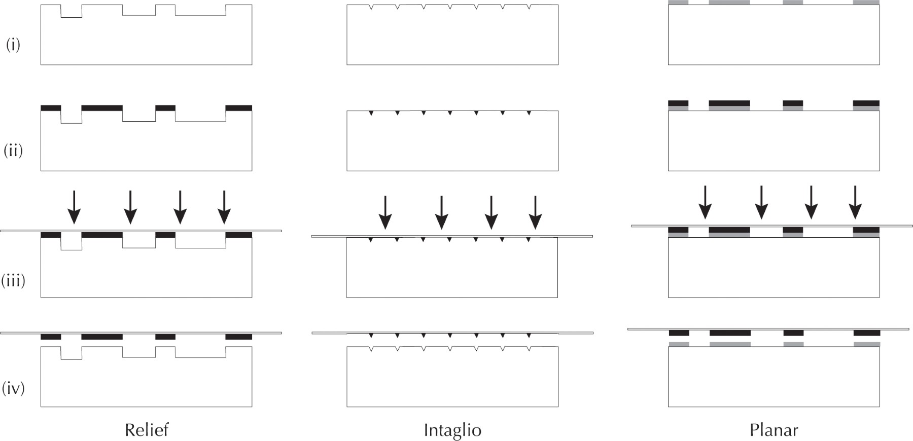
Generically speaking, printing proceeds in two stages. First, a design is transferred to some hard material (the “matrix”) and used to prepare the “printing surface”; the printing surface bears the reversed, “wrong-reading,” or mirror image of the desired, final design. Second, the printing surface is inked and forcibly pressed against a material, or “substrate,” transferring the ink from the printing surface to the substrate; when the substrate is peeled off, it now “supports” the “right-reading” impression (see figs. 5 and 12 below). The substrate is usually a sheet of paper, but vellum or textiles such as cotton or silk have occasionally been used.
The default mode of printing is “monochromatic,” in which one ink—one color—is applied to the entire printing surface. That one ink has usually been black, but it does not have to be. It is possible to apply several different inks to one printing surface, so as to print multicolor images. Such printing à la poupée is inconsistent, however, because each hand-application of the colored ink will vary slightly. Moreover, application of the inks is imprecise. The technique therefore remains an artistic technique.
If each printing surface is monochromatic, a multi-colored image must be printed from multiple printing surfaces, one for each color in the final design (fig. 3). This requires the substrate—one sheet of paper—to be passed through a press multiple times, once for each color in turn, to build up the final design. This is the case regardless of the actual printing technique used. In preparing the different printing surfaces and then in printing them, care must always be taken to ensure that the colors all align properly on the paper, that they are all “in register.”
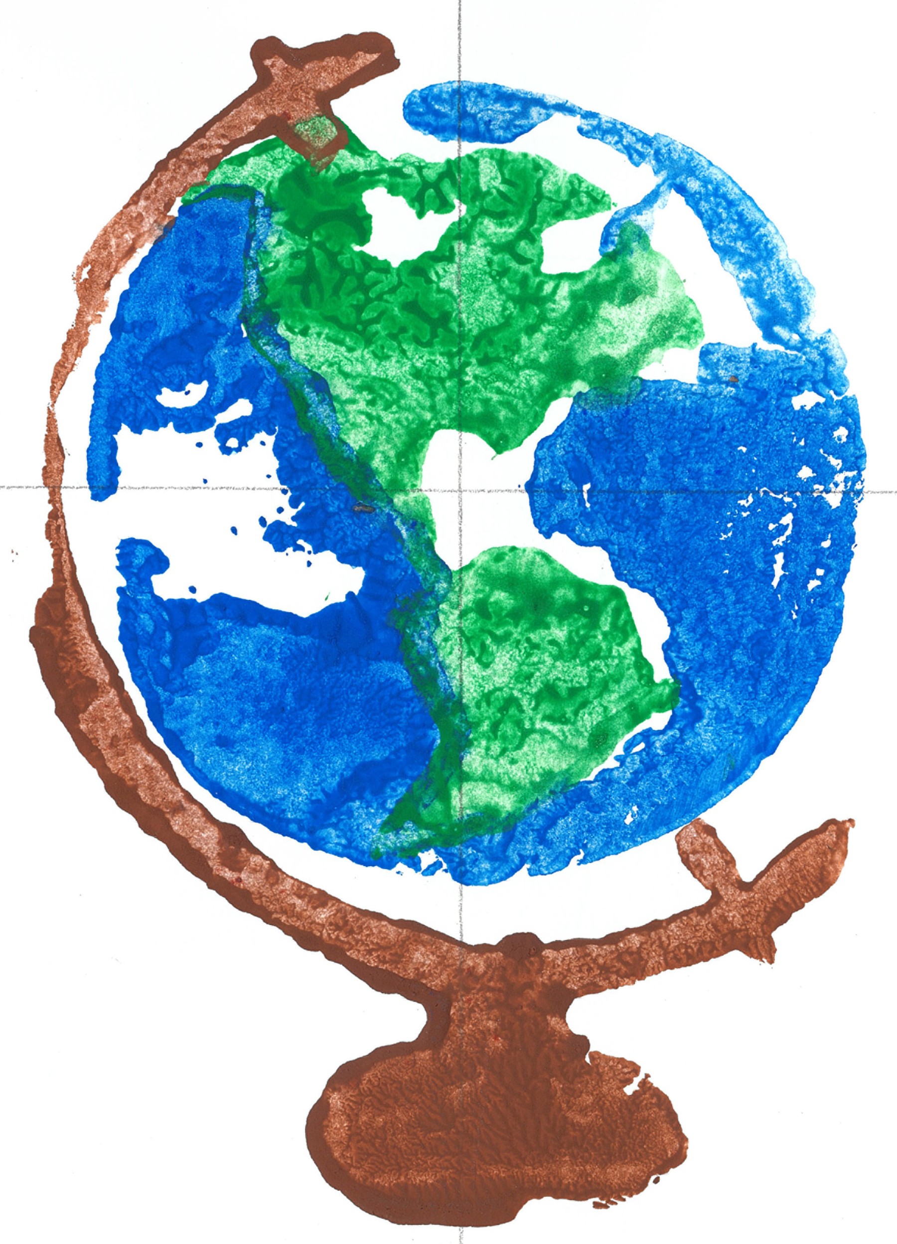
Two basic approaches to printing images were developed in fifteenth-century Europe, adapting craft practices that had been in use well before Johannes Gutenberg developed moveable type for printing letters in the 1450s. The “relief” technique originated in the practice of stamping designs onto cloth, in the manner of potato-prints (fig. 3). However, rather than pressing the potato onto the paper, for printing the paper is pressed down onto the static printing surface bearing the ink (fig. 4 LEFT). This approach was primarily implemented north of the Alps with the use of carved, or “cut,” wood blocks. The decorative engraving of metal plate in armor and tableware suggested another approach. The “intaglio” technique creates a printing surface by incising fine lines into the matrix; the ink lies within these lines (fig. 4 CENTER). This second technique was largely implemented south of the Alps with copper plates. (“Intaglio” is Italian for incised or engraved.)
Use of wood-block relief printing in map production fell away after 1550, although the technique remained in occasional use well into the eighteenth century. Copper engraving became the standard technique for printing maps throughout the remainder of the early modern era, being eclipsed by other techniques only in the second quarter of the nineteenth century; some of those techniques reintroduced relief printing from wood and other materials.
Woodcut Maps
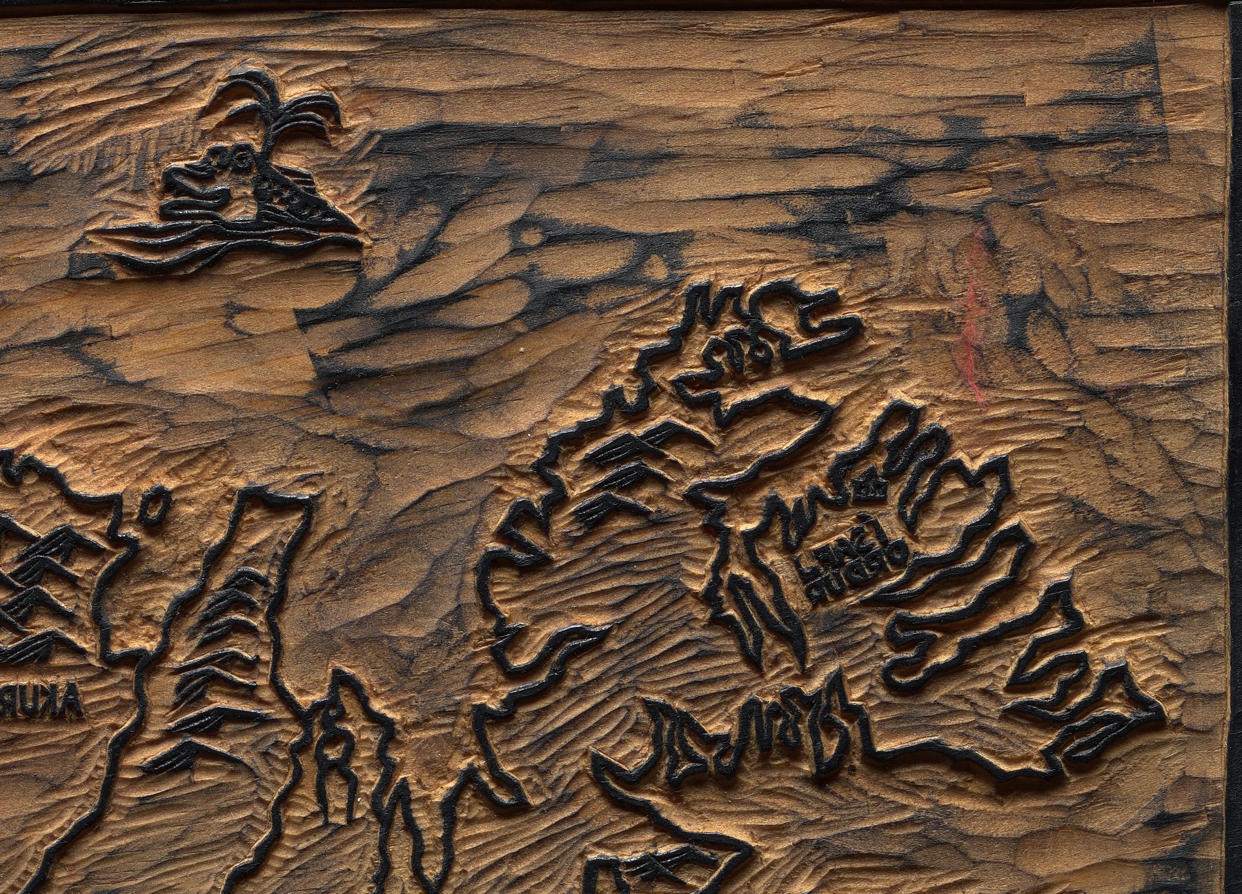
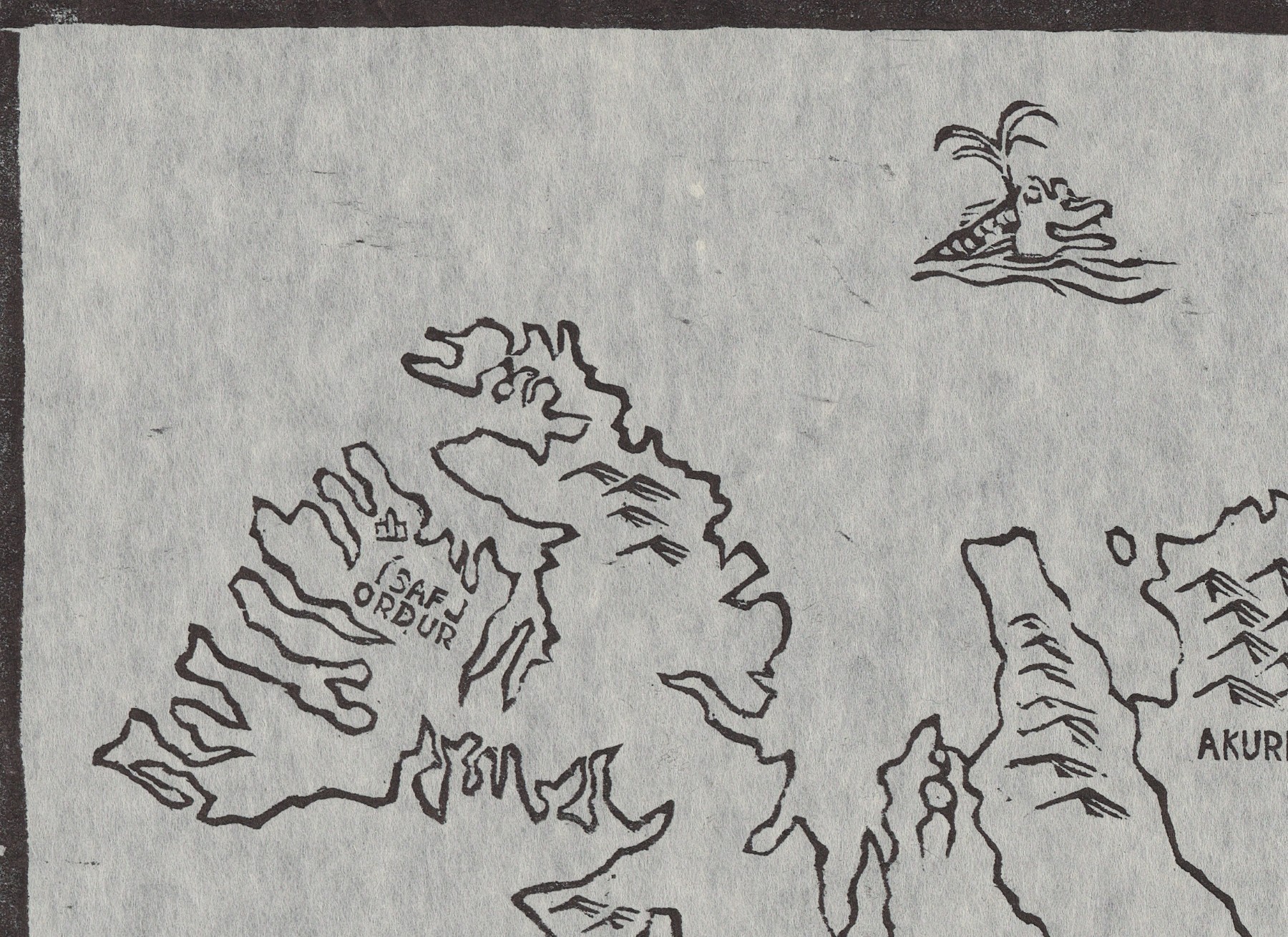
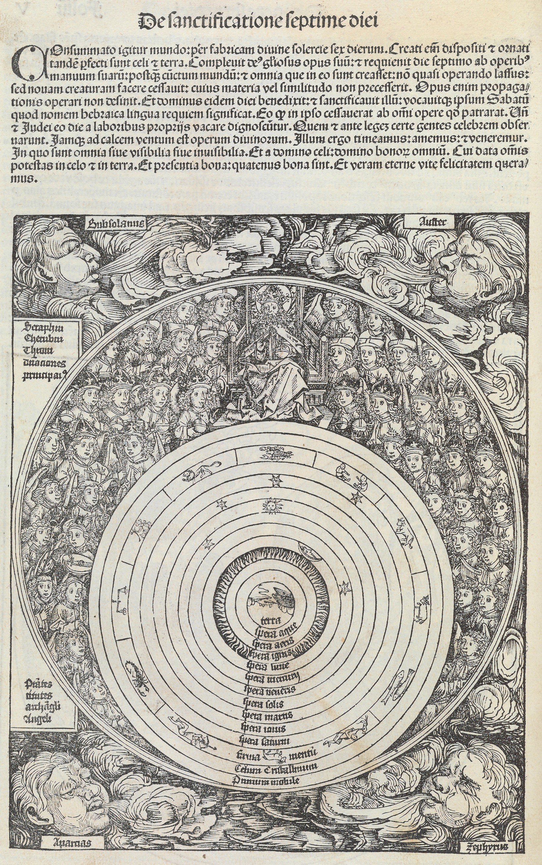
In woodcuts, the cutter carves the plank surface of a block of hardwood, usually pearwood but possibly cherry or walnut. Those areas that are not going to be printed are cut away (fig. 5-1). The remaining, raised parts of the wood block take the ink and transfer it to the paper in printing (fig. 5-2). The generic woodblock, or “xylograph,” was carved with letters as well as graphics. Beginning in the seventh century CE, such blocks were used to print books and images in China, Korea, and Japan; the earliest known printed map survives from later twelfth-century China. The technique was adopted in fifteenth-century Europe for printing images and also “block books.”1
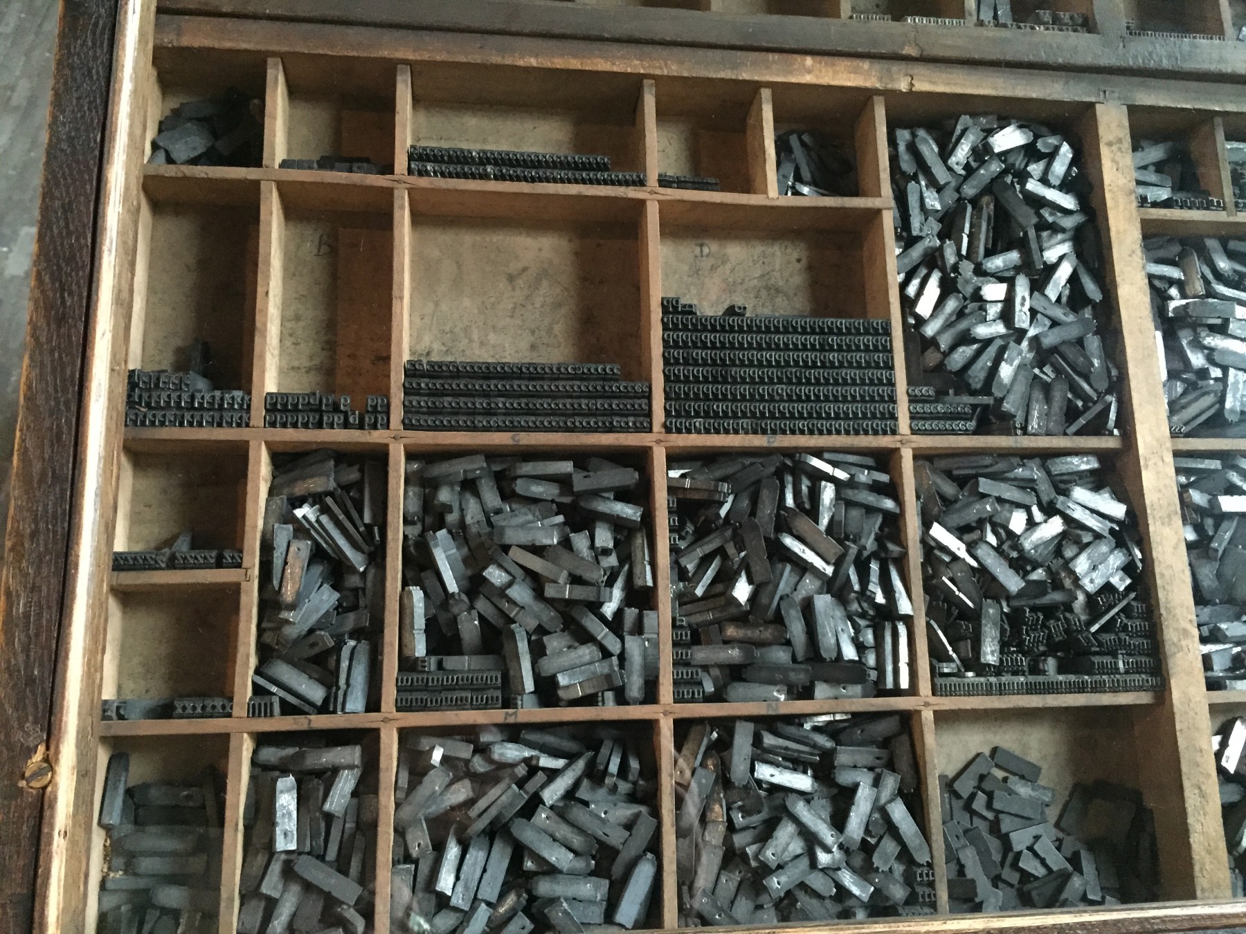
Impressions can easily be made from wood blocks by hand, simply by pressing the paper (or other material) down onto the inked printing surface. With the development in Europe of the “letterpress” to print from moveable type—in which individual letters, each on its own stub of metal (fig. 6), are assembled into lines and pages to print a book—wood blocks were printed with the same presses (fig. 7).
Indeed, if the block is the same height as the individual pieces of type (“type high”), then it can be set with the type, integrating the image within text on the printed page (fig. 8). This is perhaps the most important benefit of wood blocks: the ability to be integrated with type, to print images and text together. Letters set from type are consistently formed; letters cut within the wood block are each individually formed and so unique. Very quickly, woodcutters began to insert pieces of metal type into blocks to avoid the hassle of having to cut each letter separately. Some went further: they used the type to cast words or phrases in wet sand, then poured in metal to cast a single strip of letters on a very thin base; they could then glue each strip into notches cut into the surface of the block. This practice is called “stereotyping.”2
Woodcut maps are generally identifiable by their relatively crude and unrefined aesthetic. All the lines—for coastlines and rivers and for the strokes making each letter—were left as the remnant after the surface of the wood was cut away to either side. Each line accordingly varies in thickness and no two letters are formed in quite the same way. A few artists, notably Albrecht Dürer, executed beautifully uniform woodcuts, but most made images that were rather coarse and visually unstable. In mapping, at least, woodcut largely fell from use after 1550, although woodcut maps thereafter continued to be produced for insertion into text or when other techniques were unavailable.
From the start, relief printing was used to print multiple colors. Some books used red ink to highlight certain words (fig. 9). The process to accomplish this was relatively straightforward: all the text was set and a proof printed, to ensure that the words were properly spelled and spaced; when ready, the letters for the words to be printed in red were removed and replaced with blank stubs; the type was inked and printed in black; the words to be highlighted were then replaced, a mask applied to block out the already-printed letters, and the reinserted letters inked and printed in red. The paper could be held in registration by small pins.
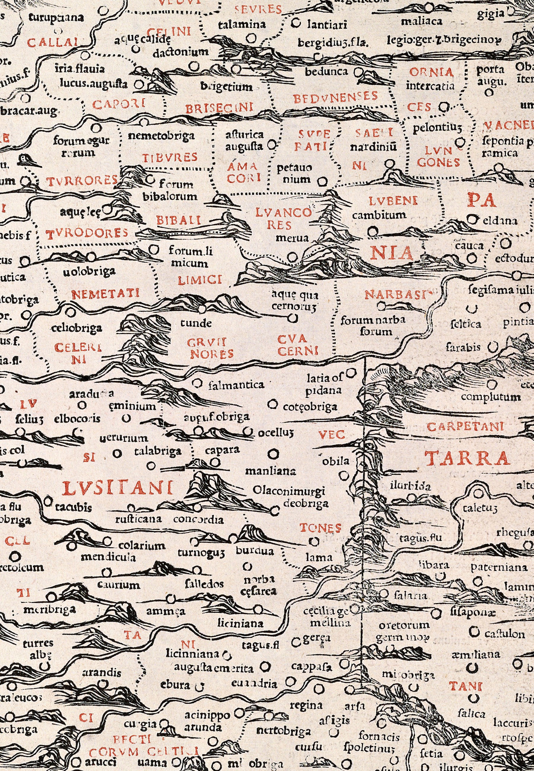
This same procedure was used throughout the printing of the text of the 1511 Venice Geography,3 with a similar technique using stereotyped lettering for its maps (fig. 10). Each map was printed from a left-hand and a right-hand wood block; each wood block was printed twice, once with important names removed for printing in black, and once with the names replaced and masked off for printing in red.4
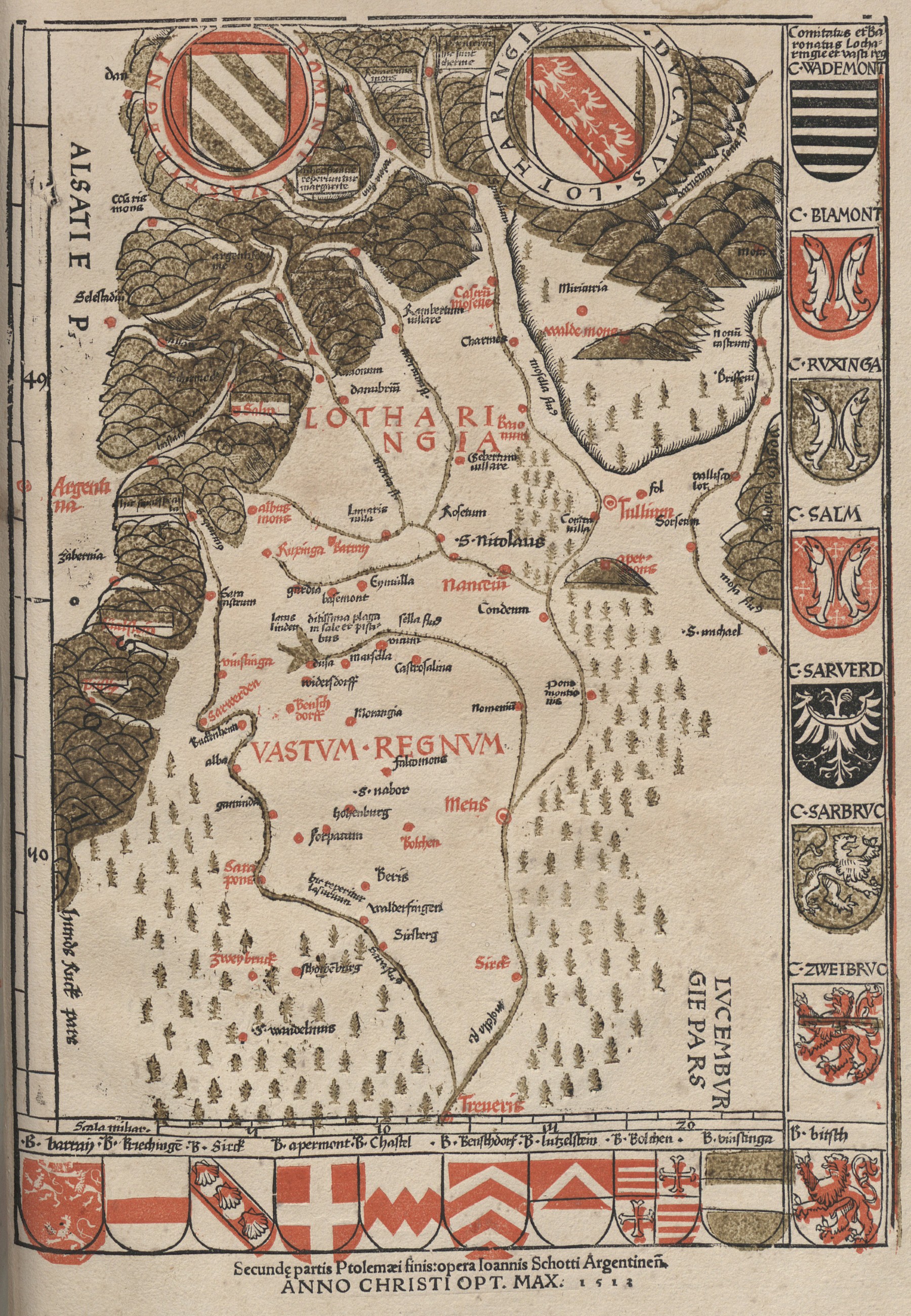
Multiple wood blocks could also be used to print multicolor images. The 1513 Strasburg Geography, with maps designed by Martin Waldseemüller, contained a map of Lotharingia (modern Lorraine, northeastern France) in three printed colors: black, red, and green (fig. 11). The region was singled out for special treatment because it was the heart of the territories of the duke of Lorraine, the key patron of Waldseemüller and his colleagues. Each impression of the map is different, with each color offset in different directions to different degrees, because the printer did not keep the three printing blocks properly in register with the paper. A few copies of the book include a first map of Europe with the seas printed in blue, but otherwise the other maps in the book were all printed in monochrome.5
The example of the 1513 Strasburg Ptolemy suggests two reasons why Renaissance geographers and printers did not pursue the color printing of maps more assiduously. First was the matter of cost: the turn away from printed color seems to have been the result of the death in 1508 of Duke René and the loss of his liberal patronage; it was cheaper to hire colorists than a master printer. Second was the matter of cultural value: given that the volume’s printer was Johann Schott, who is today lauded for his multi-color art prints from precisely registered wood blocks,6 it also seems that maps simply did not warrant the time and effort required to produce well-registered art prints.
Copper-Engraved Maps
Intaglio processes entail the creation of very thin lines within copper plates (fig, 12-1). Copper is a relatively soft metal, so one can push a knife, or “burin,” through it by hand; this is the foundation of the technique of engraving. Early on, specially crafted punches were used to reduce the engraver’s effort to stamp map signs, such as town symbols, and letters into the plate.7 Alternatively, a craftsman might cover the copper plate in a protective “ground,” lightly scratch through the ground to expose the copper, and then dunk the plate into acid to etch away the exposed copper and so form the required lines. Etching permits very tight curves to be drawn, alongside different thicknesses of lines. When used for maps, etching was generally limited to ornate cartouches (the designs around titles and imprints on a map); only very occasionally was etching used for an entire map. (If only a small part of a plate was to be etched, then a temporary berm might be constructed on the plate’s surface from a putty-like substance to hold the acid.) Unlike woodcuts, which can print large areas of ink, intaglio printing technologies permit only thin lines of ink; shading is therefore achieved by close-set lines or cross-hatching.
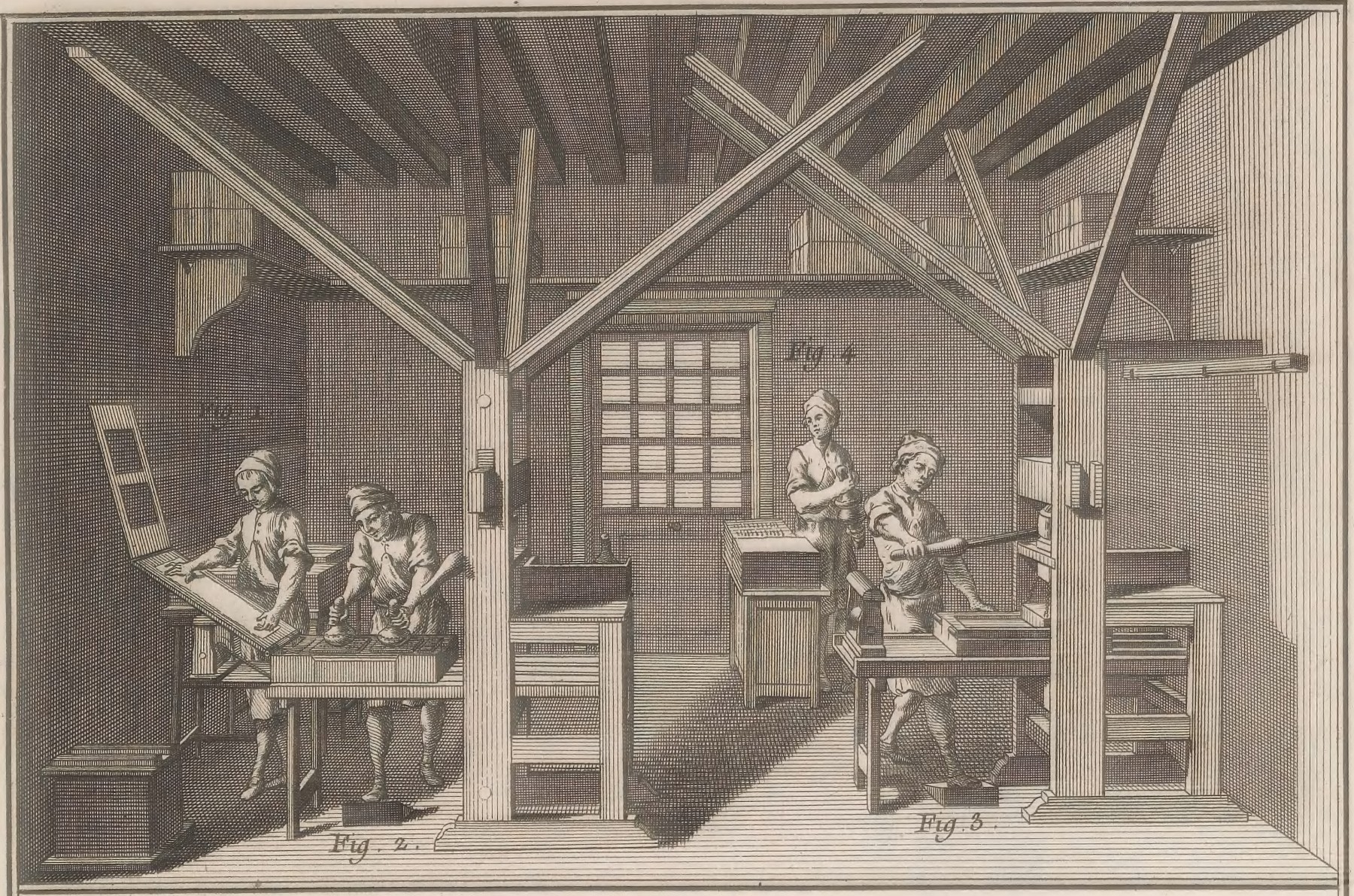
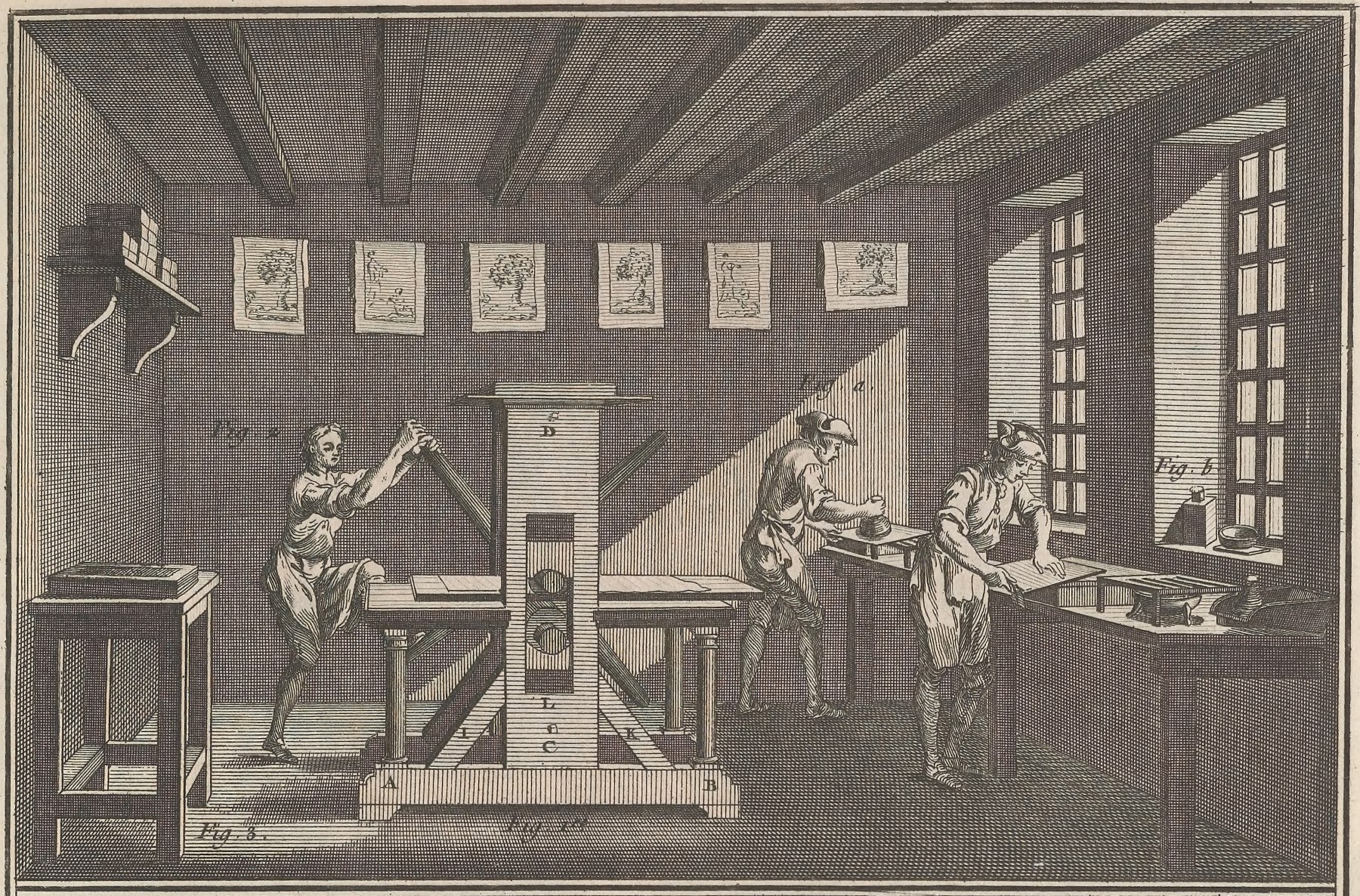
To print from such a surface is fairly laborious. To get the ink into the incised or etched lines, the entire plate must be covered in ink, and then the surface is progressively wiped clean to leave ink only in the incisions; any ink left on the plate’s surface will be applied to the paper in printing, producing a grey “plate tone” (fig. 12-2). Moreover, the inking and then printing is done while the plate is hot, expanding the plate slightly and widening the fine incisions; when printing, the paper is slightly dampened to make its surface slightly puffy, so that it will be better able to enter the incisions and pick up the ink. The press must create a very high pressure: the plate, the paper, and protective layers of paper and felt are run through a “rolling” press that squeezes the paper down into the incisions on the copper plate (fig. 13).
Despite the grueling work of printing images from copper plates, line-engraving was widely adopted across Europe in the sixteenth century for map printing. Engraving and etching gave a uniformity and consistency to the image: engraved lines did not vary in their thickness, and were of consistent visual weight; moreover, the lettering was made up of strokes of the same thickness as the lines that made up the coastlines and rivers.8 Aesthetically, line engraving made the early modern map. There was significant variation between engravers in terms of their skills and abilities, but individual maps cohered aesthetically. Other than aesthetics, the tell-tale indicator of copper-plate printing was the “plate mark,” the permanent deformation in the paper caused by its compression around the lip of the copper plate (see fig. 12 RIGHT).
Copper-plate printing was overwhelmingly monochrome in its application. Registering the plate and paper as they lay on the bed of the rolling press was itself hard and made all the more difficult by the variable sizes of both the plate, as it was heated and then cooled off, and of the sheets of paper, as they dried and as they were compressed and work hardened by printing. These problems did not deter some printers from experimentation. In the 1750s, for example, the French chart maker Jacques-Nicolas Bellin sought to eliminate having to engrave the crisscrossing network of wind lines on each and every chart he made for the French navy by printing them in color from a separately engraved plate [Cat. 5 (network in red); see also OML 53822 (green)]. He had holes drilled in each side of the plate, and pins were used to ensure registration. The resultant marks on the final image are obvious (fig. 14), as are the dual but unaligned plate marks (fig. 15). Bellin seems to have abandoned two-color printing after a few years, however, and resumed engraving the network of wind lines on each chart.9
Notes
-
David Woodward, “Techniques of Map Engraving, Printing, and Coloring in the European Renaissance,” in Cartography in the European Renaissance, ed. David Woodward, vol. 3 of The History of Cartography (Chicago: University of Chicago Press, 2007), 591–610, esp. 591–92. See James Raven, ed., The Oxford Illustrated History of the Book (Oxford: Oxford University Press, 2020), 85–92. ↩︎
-
See Woodward, Five Centuries of Map Printing, 25–50. ↩︎
-
The works commonly treated as modern “editions” of the second-century CE Geography of Claudius Ptolemy were so heavily edited and augmented that they should be treated as a genre rather than editions of a particular work. ↩︎
-
David Woodward, Bernardvs Sylvanvs Eboliensis de vniversali habitabilis figvra cvm additionibvs locorvm nvper inventorvm Venetiis MDXI / Bernardo Sylvano of Eboli: A Map of the Whole World with the Addition of Recently Discovered Places, Venice, 1511 (Chicago: Speculum Orbis Press, 1983), [9]–[10]. ↩︎
-
Chet Van Duzer, “Colored as Creators Intended: Painted Maps in the 1513 Edition of Ptolemy’s ‘Geography,’” Imago temporis–Medium aevum 13 (2019): 311–31; also, David Woodward, “Techniques of Map Engraving, Printing, and Coloring,” 594 and pl. 15 (four impressions of the map). In general, see Antony Griffiths, Prints and Printmaking: An Introduction to the History and Techniques, 2d ed. (London: The British Museum, 1996), 115–17. ↩︎
-
Ad Stijnman and Elizabeth Savage, eds., Printing Colour 1400–1700: History, Techniques, Functions and Receptions (Leiden: Brill, 2015); Elizabeth Savage, Early Colour Printing: German Renaissance Woodcuts at the British Museum (London: Paul Holberton Publishing and the British Museum, 2021). ↩︎
-
Tony Campbell, “Letter Punches: A Little-Known Feature of Early Engraved Maps,” Print Quarterly 4, no. 2 (1987): 151–54. Catherine Delano Smith, “Signs on Printed Topographical Maps, ca. 1470–ca. 1640,” in Cartography in the European Renaissance, ed. Woodward, 528–90, esp. 530–31. ↩︎
-
David Woodward, “The Manuscript, Engraved, and Typographic Traditions of Map Lettering,” in Art and Cartography, ed. Woodward, 174–212. ↩︎
-
Ingrid Kretschmer, “Color Printing,” in Cartography in the European Enlightenment, ed. Matthew H. Edney and Mary Sponberg Pedley, vol. 4 of The History of Cartography (Chicago: University of Chicago Press, 2019), 1260–63; re Bellin, see Mary Sponberg Pedley, The Commerce of Cartography: Making and Marketing Maps in Eighteenth-Century France and England (Chicago: University of Chicago Press, 2005), 46, pls. 2–3. Generally, see Griffiths, Prints and Printmaking, 117–19. ↩︎